Lounge Color Schemes For A Harmonious Design – Lounge color schemes play a pivotal role in shaping the atmosphere and mood of a space, offering a unique opportunity to express personal style and create inviting environments. The choice of colors can influence not only the aesthetics but also the emotional response of those who inhabit the lounge, making it essential to select palettes that resonate with the intended ambiance.
With an array of popular trends and timeless combinations, understanding how color interacts with design can elevate any lounge experience.
From classic pairings that exude elegance to modern palettes that reflect contemporary taste, the impact of color schemes extends beyond mere visual appeal. Delving into these aspects will provide valuable insights for anyone looking to enhance their lounge with thoughtfully curated colors.
Introduction to Lounge Color Schemes
Color schemes play a pivotal role in lounge design, not only defining the aesthetic appeal but also influencing the overall ambiance and functionality of the space. A well-chosen color palette can enhance comfort, promote relaxation, and facilitate social interactions, making it essential for creating an inviting environment. The selection of colors can also reflect personal style, trends, and the intended purpose of the lounge.In contemporary lounge design, several popular color trends have emerged, highlighting the dynamic relationship between color and mood.
From soothing neutrals to vibrant accent hues, each choice serves a distinct purpose in shaping the experience within the lounge. The impact of color extends beyond mere appearance; it can evoke emotions, set the tone for gatherings, and even influence behavior. Understanding these elements is vital for anyone involved in designing or renovating lounge spaces.
Popular Lounge Color Trends
Current trends in lounge color schemes are characterized by their versatility and emotional resonance. The following are some of the most notable color preferences in lounge design today:
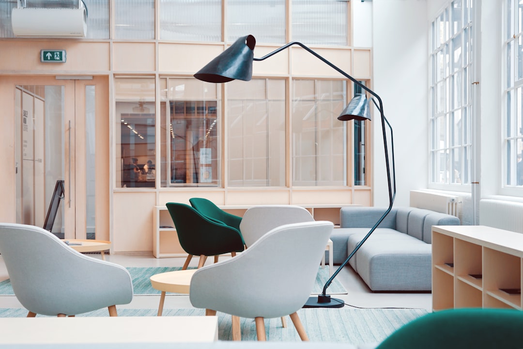
- Earthy Tones: Shades like terracotta, olive green, and warm browns create a cozy atmosphere that connects the indoors with nature.
- Soft Pastels: Light colors such as blush pink, mint green, and lavender foster a serene environment, ideal for relaxation and casual conversation.
- Bold Accents: Incorporating vibrant colors like deep navy or rich emerald can serve as stunning focal points without overwhelming the space.
- Monochromatic Schemes: Using varying shades of a single color can create a sophisticated and cohesive look, enhancing the lounge’s elegance.
- Contrasting Colors: Strategically pairing complementary colors can energize a lounge, fostering a lively atmosphere suitable for social gatherings.
The application of these trends not only enhances visual appeal but also plays a significant role in mood regulation. Thus, it becomes essential to consider the psychological effects of color when selecting a palette for lounge spaces.
“Color is the keyboard, the eyes are the harmonies, the soul is the piano with many strings.” – Wassily Kandinsky
Research indicates that colors can influence emotions in various ways. For instance, warm colors are often associated with energy and excitement, while cool tones can evoke calmness and tranquility. By thoughtfully integrating these elements, designers can create lounges that not only look beautiful but also resonate deeply with their users, ultimately enhancing their overall experience.
Classic Color Combinations
Classic color combinations remain a popular choice for lounge design due to their timeless appeal and versatility. These pairings can evoke specific moods and atmospheres, enhancing the overall experience within the space. By understanding these combinations, one can create an inviting and aesthetically pleasing environment that resonates with comfort and style.Color combinations in lounge settings play a significant role in influencing the ambiance.
Warm colors typically include reds, oranges, and yellows, which can create an inviting and energetic atmosphere. On the other hand, cool colors such as blues, greens, and purples tend to evoke a sense of calm and relaxation. The choice between warm and cool combinations can significantly impact the feel of a lounge, making it essential to select the right palette based on the desired mood.
Timeless Color Pairings
Classic color combinations can be categorized into several themes that enhance the lounge experience. Below is a detailed representation of some of the most effective pairings, accompanied by visual descriptions that highlight their aesthetic value.
| Color Combination | Description |
|---|---|
| Warm Neutrals | Comprising shades such as beige, taupe, and soft browns that create a cozy and inviting atmosphere. This palette is often complemented with accents of burnt orange or deep red, adding warmth and energy. |
| Classic Blue and White | This combination evokes a fresh, serene feel, with crisp white providing a clean backdrop and classic blue adding depth and elegance. Often seen in coastal-themed lounges, it promotes tranquility. |
| Earthy Tones | Colors like olive green, terracotta, and deep browns bring a natural feel to lounges. This combination fosters a connection with nature and often features rich textures to enhance its warm, inviting quality. |
| Monochromatic Grays | A modern and sophisticated choice, this palette utilizes varying shades of gray, accented with metallics such as silver or gold. It creates a chic, contemporary look while remaining versatile. |
| Bold Contrasts | Using striking combinations like navy blue and bright yellow produces a dynamic and vibrant energy. This pairing is suitable for more modern lounges aiming for a lively and engaging atmosphere. |
The selection of color combinations plays a pivotal role in setting the desired mood within a lounge. Choosing between warm and cool tones allows for tailored environments that reflect personal style and intended use, ensuring a harmonious and inviting space for relaxation and social interaction.
Modern Color Palettes: Lounge Color Schemes
Contemporary design emphasizes the importance of color in creating inviting and dynamic lounge spaces. A well-chosen color palette not only enhances the aesthetic of a lounge but also affects the psychological well-being and social interactions of its occupants. This section explores modern color schemes that resonate with today’s design ethos, illustrating their impact on mood and the overall atmosphere of lounge environments.In modern lounge aesthetics, certain colors are recognized for their psychological effects.
For instance, blues and greens are often associated with tranquility and relaxation, promoting peaceful interactions among guests. Conversely, bold colors like orange and red can stimulate conversation and energize the space. When incorporating bold hues into a lounge setting, it’s crucial to balance them with neutral tones to maintain harmony. Neutral colors such as grays, beiges, and whites serve as a backdrop that allows bold colors to pop without overwhelming the space.
Trendy Color Palettes
Modern lounge designs benefit from a variety of trendy color palettes that can be categorized by seasonal trends, popular themes, and complementary materials. Understanding these palettes can greatly enhance the design process.
- Spring/Summer Trends:
- Soft pastels: Light pinks, mint greens, and buttery yellows paired with natural wood materials.
- Vibrant tropical: Bright corals, turquoise, and sunny yellows with wicker and rattan furniture.
- Fall/Winter Trends:
- Rich jewel tones: Deep emeralds, royal blues, and burgundies complemented by velvet upholstery and metallic accents.
- Warm earthy tones: Terracotta, olive greens, and ochres with rustic wood and textured fabrics.
- Popular Themes:
- Coastal: Soft blues, sandy beiges, and crisp whites with natural fibers and coastal decor.
- Urban: Grays, blacks, and bold pops of color like neon yellow or electric blue with industrial elements.
- Minimalist: Monochromatic shades of black, white, and gray with clean lines and functional furniture.
Successful lounge transformations often utilize these modern color palettes effectively. For instance, a lounge that previously featured dull beige walls was revitalized with a bold navy blue accent wall complemented by warm wooden furniture and gold accents, creating a striking contrast that invites social interaction. In another example, a minimalistic lounge transformed by incorporating soft pastel cushions and art pieces against a white backdrop created a serene and welcoming atmosphere.When selecting color palettes, it is vital to consider the size and lighting of the lounge.
Lighter colors can make small spaces feel larger and more open, while darker hues can provide an intimate atmosphere. Testing colors in different lighting conditions is crucial, as natural and artificial light can alter how colors appear. To enhance the chosen color palette, accessories and decor items like cushions, rugs, and wall art should be deliberately selected. For instance, a lounge with a teal and gold color scheme can be accentuated with gold-framed mirrors, teal cushions, and a textured rug that ties the color story together.
The proportion and placement of these items can significantly affect visual balance.Sustainability is an essential consideration in modern design. Eco-friendly paints and materials are increasingly being favored for their lower environmental impact. Non-toxic paints and sustainably sourced furniture align with contemporary color trends while promoting a conscious lifestyle.To assist individuals in discovering which color palettes resonate with their personal style and the intended purpose of their lounge, a quiz format can be employed.
This quiz would pose a series of statements about preferences and usage, helping to guide users toward suitable color combinations.Cultural influences significantly impact color interpretation in interior design. Different cultures associate colors with various meanings; for example, red symbolizes luck in Chinese cultures but can signify danger in others. Fusion palettes that incorporate these diverse perspectives can create an inclusive and enriched design, blending colors like vibrant reds and soothing blues to celebrate multicultural influences.
Neutral Color Schemes
Neutral color schemes have gained immense popularity in lounge spaces due to their versatility and timeless appeal. These tones create a calming atmosphere while serving as a perfect canvas for various design elements. By incorporating neutral colors, homeowners can achieve a sophisticated and elegant ambiance that is both welcoming and serene.The allure of neutral tones lies in their ability to blend harmoniously with different styles and furnishings.
These shades, ranging from whites and beiges to grays and taupes, provide a sense of balance and tranquility which is essential for relaxation in a lounge environment. Additionally, neutral palettes allow for the integration of vibrant accent colors, ensuring that the space does not feel bland or monotonous.
Methods to Warm Up a Neutral Color Scheme
While neutral colors can create a serene backdrop, incorporating warmth is crucial to prevent the space from feeling cold or uninviting. Here are several methods to enhance a neutral color scheme:
- Add Textured Fabrics: Incorporate textiles such as soft throws, plush cushions, and woven rugs to introduce warmth and depth. Natural materials like wool, cotton, and linen can add comfort and a tactile quality.
- Introduce Warm Wood Elements: Furniture made from warm-toned woods, such as oak or walnut, can provide a cozy contrast to cooler neutrals. Wooden coffee tables, bookshelves, or accent chairs can create visual interest.
- Utilize Warm Lighting: Lighting plays a pivotal role in setting the mood. Opt for warm white bulbs or decorative lamps with soft shades to create an inviting atmosphere in the lounge.
- Incorporate Natural Elements: Adding greenery through houseplants can bring life and warmth to a neutral space. Plants like ferns, snake plants, or succulents can complement the color scheme while promoting well-being.
- Implement Accent Colors: Use colorful accessories, such as artwork, vases, or cushions, to inject personality into the lounge. Earthy tones like terracotta or muted pastels can enhance the warmth of the neutral base.
Examples of Successful Neutral Lounge Setups
Exploring successful neutral lounge setups can provide inspiration for creating a harmonious space. Notable examples include:
- Scandinavian Minimalism: A lounge featuring soft white walls, a light gray sofa, and light wooden furniture creates a calm and airy atmosphere. Accents of greenery and simple decorative elements enhance the aesthetic without overwhelming it.
- Modern Farmhouse: A combination of beige walls and rustic wood accents, paired with soft textiles and muted pastel decor, can establish a warm and inviting lounge. Accessories like vintage-inspired lanterns or woven baskets add charm to the setup.
- Contemporary Chic: A lounge with a palette of taupe and cream, featuring plush furniture and metallic accents, showcases elegance. Thoughtfully placed artwork and bold accents in mustard or deep blue create focal points within the neutral scheme.
The Role of Accent Colors

Accent colors play a pivotal role in lounge design by adding depth, personality, and vibrancy to the space. They are integral in creating focal points and enhancing the overall aesthetic appeal of the lounge while also influencing the mood and ambiance. Understanding the psychological impact of colors can aid in selecting the right accent hues to evoke desired feelings and responses in those who inhabit the space.Effective use of accent colors involves a strategic approach that considers the dominant color scheme of the lounge.
Each color carries its own emotional weight; for example, blue is often associated with tranquility, while red can evoke energy and excitement. Popular accent colors vary by lounge theme, which can significantly influence the design’s overall character.
Popular Accent Colors for Different Lounge Themes
The choice of accent colors can transform a lounge into a cohesive environment that reflects personal style and thematic goals. Below is a table that identifies suggested accent colors for various lounge themes, along with their psychological impact on mood.
| Element | Suggested Accent Color | Theme | Impact on Mood |
|---|---|---|---|
| Sofa | Teal | Modern | Calming and refreshing |
| Wall Art | Mustard Yellow | Industrial | Energizing and vibrant |
| Cushions | Coral | Bohemian | Warm and inviting |
| Lighting Fixtures | Copper | Traditional | Elegant and cohesive |
Successful Lounge Designs Utilizing Accent Colors
Examples of successful lounge designs can illustrate the effective application of accent colors. One notable example is a modern lounge featuring a teal sofa complemented by neutral walls and light wood accents, creating a serene yet stylish atmosphere. In contrast, an industrial lounge may showcase vibrant mustard yellow wall art against a backdrop of raw materials, delivering an energetic vibe.
These spaces exemplify how well-chosen accent colors can harmonize with primary color palettes while achieving a distinct character.
Color Combinations and Balance
Selecting color combinations that pair well with primary lounge colors is essential to avoid clashing and ensure visual harmony. For instance, pairing a soft gray with navy blue and coral can create a sophisticated and inviting combination. The importance of balance cannot be overstated; incorporating accent colors should enhance rather than dominate the space. Careful consideration must be given to the quantity and placement of accent colors to maintain a cohesive look.
Checklist for Selecting Accent Colors
A thorough checklist can assist in the selection of accent colors based on personal preference and design goals. Factors to consider include:
- Personal Style: Identify colors that resonate with your personal tastes.
- Existing Furniture: Take into account the colors present in your existing furnishings.
- Overall Design Goals: Consider the atmosphere you wish to create—relaxing, energizing, or inviting.
- Complementary Colors: Choose colors that complement rather than clash with primary hues.
- Texture and Material Compatibility: Consider how different textures can enhance accent colors.
Trends for Accent Colors in Lounge Design
Emerging trends in accent colors for the upcoming year include earthy tones such as terracotta and olive green, which provide a grounded and organic feel, aligning with the increasing focus on sustainability and natural aesthetics. Additionally, bold jewel tones like emerald green and sapphire blue are gaining popularity, offering a luxurious and vibrant contrast to neutral backgrounds. Experimenting with different textures and materials can further enhance the visual impact of accent colors.
Incorporating fabrics, woods, and metals can create a layered look that complements and enhances the chosen accent hues.
Seasonal Color Trends
Seasonal changes significantly influence lounge colors, reflecting the fluctuations in nature and the emotional responses they evoke. Each season brings a unique palette that can enhance the atmosphere of a lounge, creating a space that feels both inviting and in harmony with the outside world. Understanding the psychological effects of colors during different seasons can help in making informed choices that resonate with personal style and seasonal moods.
Psychological Effects of Colors by Season
Colors can evoke different emotions and responses depending on the time of year. For instance, spring is often associated with renewal and growth, making vibrant and fresh colors popular. In contrast, winter brings a sense of calm and coziness, favoring deeper and warmer tones. The following color palettes can be effectively utilized to match each season:
- Spring: Soft pastels and floral-inspired colors create a rejuvenating atmosphere. Recommended palette includes:
- Pale Pink (#FFC0CB)
- Lavender (#E6E6FA)
- Mint Green (#98FF98)
- Sky Blue (#87CEEB)
- Summer: Bright and lively colors bring energy and joy. Recommended palette includes:
- Coral (#FF7F50)
- Turquoise (#40E0D0)
- Sunny Yellow (#FFD700)
- Vibrant Green (#32CD32)
- Autumn: Warm and earthy tones reflect the changing leaves and cozy ambiance. Recommended palette includes:
- Burnt Orange (#FF4500)
- Mustard Yellow (#FFD300)
- Deep Red (#8B0000)
- Olive Green (#556B2F)
- Winter: Cool and muted shades create a tranquil and intimate environment. Recommended palette includes:
- Dark Blue (#00008B)
- Charcoal Grey (#36454F)
- Burgundy (#800020)
- Ivory (#FFFFF0)
Seasonal Decor Enhancements
Incorporating seasonal decor elements can greatly enhance the aesthetics of a lounge. Here are suggestions for textiles, artwork, and natural elements that align with seasonal color schemes:
- Textiles: Choosing the right materials can significantly influence comfort and style.
- Spring: Lightweight cotton curtains and floral-patterned cushions.
- Summer: Breezy linen or sheer curtains with vibrant, colorful throws.
- Autumn: Warm woolen blankets and textured fabrics like corduroy for cushions.
- Winter: Heavy, insulated drapes and soft, plush throws for warmth.
- Artwork: Seasonal artwork can complement the chosen color schemes.
- Spring: Botanical prints or abstract pieces in soft pastels.
- Summer: Bright landscapes or beach-themed artwork.
- Autumn: Nature-inspired pieces showcasing fall foliage.
- Winter: Abstract art with cool tones or cozy, winter scenes.
- Natural Elements: Integrating natural elements adds warmth and authenticity.
- Spring: Fresh flowers such as tulips or daisies in pastel vases.
- Summer: Branches of blossoming trees or vibrant potted plants.
- Autumn: Decorative pumpkins or branches with colorful leaves.
- Winter: Pinecones, evergreen branches, or dry twigs arranged in a stylish manner.
Impact of Lighting on Color Perception
Lighting plays a crucial role in how colors are perceived throughout the seasons. During spring and summer, natural light is abundant, making cooler tones appear brighter. In contrast, winter’s shorter days may require warmer lighting to enhance gray or blue hues in the decor. Consider the following lighting solutions:
- Utilize warm white LED bulbs during fall and winter to create a cozy atmosphere.
- Incorporate cooler daylight bulbs during spring and summer to enhance freshness.
- Employ dimmers to adjust light intensity based on seasonal mood and time of day.
Maintaining Cohesion Throughout the Year
To achieve a cohesive year-round look while incorporating seasonal decor changes, consider these strategies:
- Establish a base color palette that complements all seasons, allowing for seasonal accents.
- Invest in versatile furniture pieces that can accommodate various decor styles.
- Use storage solutions like decorative bins or under-sofa storage for off-season items, ensuring easy rotation.
Popular Color Trends Comparison Table
To illustrate shifting preferences among decor enthusiasts, the following table summarizes popular color trends over the past few years:
| Season | 2019 | 2020 | 2021 | 2022 | 2023 |
|---|---|---|---|---|---|
| Spring | Pastel Pink | Mint Green | Coral | Lavender | Pale Yellow |
| Summer | Turquoise | Sunny Yellow | Bright Red | Light Blue | Vibrant Green |
| Autumn | Burnt Orange | Mustard Yellow | Deep Red | Olive Green | Burgundy |
| Winter | Charcoal Grey | Dark Blue | Ivory | Deep Green | Muted Purple |
DIY Projects for Seasonal Personalization
Engaging in DIY projects can be an enjoyable way to personalize lounge spaces while aligning with seasonal color trends. Consider these ideas:
- Create seasonal wreaths using materials that reflect the current season’s palette.
- Design custom cushion covers with fabric paint to match your seasonal theme.
- Build decorative shelving to showcase seasonal decor items or plants.
Resources for Further Exploration
For those seeking to delve deeper into seasonal color trends, the following resources offer valuable insights and inspiration:
- Color Psychology: Seasonal Trends
- Houzz: Color Trends and Tips
- Apartment Therapy: Seasonal Color Ideas
Cultural Influences on Color Choices
Cultural influences play a significant role in shaping lounge color schemes, as colors often carry different meanings and associations across various cultures. Understanding these influences can guide designers in creating spaces that resonate with a diverse audience while respecting cultural sensitivities. This section explores how specific cultural contexts impact color choices and presents a comparative analysis of color preferences across cultures.
Color Meanings in Different Cultures
Colors can convey distinct emotions and symbolisms based on cultural perspectives. For instance, white is often associated with purity and peace in Western cultures, while in many Eastern cultures, it is linked to mourning and death. Recognizing these meanings is crucial for effective design. Below is a brief Artikel of specific colors and their cultural significance:
- Red: In China, red symbolizes good fortune and joy, making it a popular choice for celebrations. In contrast, in South Africa, red can signify mourning.
- Blue: In many Middle Eastern cultures, blue is seen as a protective color, believed to ward off evil spirits. Conversely, in Western cultures, it often represents calmness and stability.
- Green: Green is revered in Islamic cultures as a sacred color, symbolizing paradise. In Western contexts, it is frequently associated with nature and growth.
- Yellow: In India, yellow is associated with knowledge and learning, often used in religious ceremonies. However, in some African cultures, it can represent wealth and status.
Incorporating these cultural color meanings into lounge designs can enhance the emotional resonance of the space.
Comparison of Color Preferences Across Cultures
Understanding color preferences across cultures allows designers to create more inclusive and appealing environments. The table below summarizes various cultural preferences for specific colors:
| Cultural Group | Preferred Colors | Associated Meanings |
|---|---|---|
| Western Cultures | Blue, Green, Yellow | Calm, Growth, Happiness |
| Eastern Cultures | Red, Gold, White | Good Fortune, Wealth, Mourning |
| Middle Eastern Cultures | Blue, Green, Red | Protection, Sacredness, Celebration |
| African Cultures | Red, Yellow, Green | Mourning, Wealth, Nature |
This comparative analysis emphasizes the diversity of color preferences and the importance of context when selecting colors for lounge spaces. By aligning color choices with cultural values, designers can create environments that are not only aesthetically pleasing but also culturally attuned and respectful.
Lighting and Color Interaction

The interplay between lighting and color is a fundamental aspect of interior design, especially in lounge settings where ambiance and aesthetics are paramount. Understanding how different types of lighting affect color perception can significantly enhance the overall appearance and mood of a space. This section delves into the impact of both natural and artificial lighting on lounge colors, providing practical strategies for achieving desired effects through thoughtful color selection and lighting design.The perception of color is inherently influenced by the quality and type of light in which it is viewed.
Natural sunlight, with its broad spectrum, can reveal the true nature of colors, while incandescent light tends to create a warm glow that can alter the appearance of hues. On the other hand, LED lighting, known for its versatility, can either enhance or mute colors depending on its temperature.
Impact of Natural and Artificial Lighting
Natural light varies throughout the day and can change the way colors are perceived in a lounge. Morning light is typically cooler, while afternoon light has a warmer hue. Incandescent lighting tends to provide a soft, warm ambiance, making colors appear richer but can also lead to a yellowish tint that might distort cooler shades. In contrast, LED lighting is available in different temperatures, from warm to cool, allowing for greater control over how colors are showcased.
To assist in selecting appropriate colors based on lighting conditions, consider the following chart that compares recommended color palettes for different lighting types:
| Lighting Type | Recommended Color Palette |
|---|---|
| Warm Incandescent | Soft creams, warm neutrals, muted pastels |
| Cool Natural Light | Bold colors, cool grays, vibrant blues |
| Cool LED | Crisp whites, cool greens, and blues |
Testing color samples at various times of day is crucial in understanding their interaction with the changing light. Paint swatches should be observed in different lighting conditions, particularly during peak daylight and evening when artificial lighting is used, to gauge the color’s true appearance.Real-life examples demonstrate how lighting can dramatically alter the perception of color in lounges. For instance, a lounge designed with warm beige walls under incandescent lighting may appear comforting and cozy, while the same color under cool LED lighting may seem stark and uninviting.
Color illusions can be a common phenomenon in interior design, where a color may appear differently depending on the surrounding light and other colors it is paired with.
Layering Lighting to Enhance Color Effects
Layering different types of lighting can significantly enhance the vibrancy of colors in a lounge. Ambient lighting provides general illumination, task lighting focuses on specific areas, and accent lighting highlights particular features or decor. By combining these lighting types, designers can create a dynamic atmosphere that maximizes the impact of color choices.To achieve an effective layering of light, consider the following suggestions:
- Utilize ambient lighting through ceiling fixtures or recessed lights for overall illumination.
- Incorporate task lighting with table lamps or floor lamps to provide focused light where needed.
- Add accent lighting with spotlights or LED strips to emphasize artwork or architectural elements.
Positioning light fixtures is equally important for color vibrancy. Fixtures should be placed strategically to avoid casting shadows that can alter the appearance of colors. For example, wall sconces can create a wash of light that enhances the texture of painted walls, while table lamps can provide warm light that complements soft furnishings.
Checklist for Color Selection in Lounges
When selecting colors for a lounge, several factors must be considered to ensure harmony with the lighting conditions. This checklist serves as a guide for homeowners and designers:
- Assess the direction of windows to understand how natural light will enter the space.
- Consider the size of the lounge, as smaller spaces may require lighter colors to appear more expansive.
- Evaluate existing furniture colors and styles to ensure color cohesion.
- Reflect on the intended mood and purpose of the lounge.
Important questions to contemplate during the selection process include:
- Will the colors provide a welcoming atmosphere in both natural and artificial light?
- How do the selected hues interact with each other under varying lighting conditions?
- Are there any colors that may clash or create undesirable effects based on the chosen lighting?
By carefully considering these aspects, designers can achieve a harmonious and visually appealing lounge that shines under all lighting conditions.
Textures and Materials in Color Schemes
Textures play a pivotal role in enhancing color schemes within lounge design. The interplay between texture and color can significantly affect the overall atmosphere of a space, influencing not only aesthetics but also sensory experiences. A well-curated combination of textures and colors can create a harmonious environment, inviting relaxation and interaction.The materials chosen in lounge design must complement specific color schemes to achieve a cohesive look.
For instance, soft fabrics can warm up cooler colors, while sleek materials can enhance modern palettes. Understanding how different textures interact with various colors is crucial for achieving the desired ambiance.
Textures that Enhance Lounge Color Palettes
The selection of textures can elevate the effectiveness of color schemes in lounge settings. Below is a list of textures that enhance and complement various color palettes:
- Velvet: This plush texture adds richness to color schemes, particularly when used with jewel tones like emerald green or sapphire blue.
- Linen: A light, breathable fabric that pairs well with soft, neutral color palettes, adding a relaxed and organic feel.
- Leather: Its durability and sophistication work seamlessly with both modern and classic color schemes, providing depth to bold colors like deep red or navy.
- Wood: Natural wood finishes introduce an earthy element that complements warm color palettes, enhancing tones like terracotta and mustard yellow.
- Metallics: Incorporating metallic textures can add a touch of elegance, particularly with colors like silver, gold, or bronze paired with darker hues for contrast.
- Wool: This textured fabric is ideal for cozy, warm spaces and harmonizes beautifully with earthy and muted color schemes.
- Glass: Transparent and reflective, glass elements can enhance the vibrancy of colors while providing a modern touch to any lounge design.
Incorporating these textures thoughtfully can significantly amplify the visual and tactile qualities of a lounge, making it a more inviting and enjoyable space for users.
DIY Color Scheming Techniques
Creating a custom color palette for your lounge can enhance its aesthetic and atmosphere significantly. Understanding the principles of color theory and utilizing effective methods can lead to a harmonious and inviting space. This section offers practical techniques for DIY enthusiasts to craft their unique color schemes, ensuring that the final result aligns with personal style and desired ambiance.
Step-by-Step Methods for Creating Custom Color Palettes
Developing a color palette begins with a solid understanding of color theory. The three primary schemes to consider include:
- Complementary Colors: Colors opposite each other on the color wheel that create a vibrant contrast.
- Analogous Colors: Colors that are next to each other on the color wheel, providing a cohesive and serene look.
- Triadic Colors: Three colors evenly spaced on the color wheel that create a dynamic and balanced palette.
To select a base color, start by considering the mood you wish to convey. Use this base color as a foundation to build your palette. For example, if you choose a soft blue as your base, you may want to incorporate analogous greens and purples for harmony or complementary orange for contrast. Online tools and apps like Coolors and Adobe Color can assist in generating color harmonies based on your base color selection.
Testing Colors in a Lounge Setting
Visualizing colors in your space is crucial before making any final decisions. Start by utilizing color swatches and sample boards to see how colors interact with your lounge’s furnishings and light.
- Test colors at different times of the day to observe how natural and artificial lighting affects their appearance.
- Compare your selected colors against existing decor to ensure cohesive integration.
- Use painter’s tape to section off areas with different colors, allowing for a temporary view of how they look together in the space.
Tools and Resources for DIY Color Selection
A variety of tools can aid in the color selection process. Both digital and physical resources can offer inspiration and guidance.
- Websites and Apps: Coolors, Adobe Color, and Color Hunt are excellent online tools for generating color palettes.
- Physical Tools: A color wheel, paint samples, and mood boards are effective for hands-on exploration.
- Inspirational Resources: Pinterest boards, design magazines, and home decor blogs can provide fresh ideas and trends.
Psychological Effects of Color in a Lounge
Colors have profound psychological impacts that can influence the mood and ambiance of your lounge.
- Calmness: Blues and greens can evoke tranquility, making them ideal for relaxation spaces.
- Energy: Yellows and oranges can create a lively atmosphere, promoting social interactions.
- Warmth: Earth tones can instill a sense of comfort and coziness in a lounge setting.
Consider the desired emotional response when selecting color combinations for your space.
Common Color Pitfalls and How to Avoid Them
When designing a color scheme, certain pitfalls can detract from the overall effect.
- Over-Saturation: Using too many bright colors can overwhelm the space; balance with neutral tones.
- Color Clashes: In multi-functional spaces, ensure that chosen colors harmonize to avoid dissonance.
Final Checklist for a Successful DIY Color Scheme
Before committing to your chosen colors, ensure that your scheme aligns with several critical factors:
- Consistency with the overall theme of the lounge.
- Functionality of the space, ensuring colors complement the activities occurring within.
- Personal comfort and preference, ensuring the environment feels inviting.
Creating a final mockup or rendering can be beneficial before painting, allowing for a last review of the envisioned outcome.
Documenting and Sharing the DIY Color Process
Engaging in the DIY color process can be rewarding, and sharing your journey can inspire others.
- Create a blog or utilize social media platforms to showcase before-and-after results of your lounge transformation.
- Engage with DIY communities online to gain feedback, share experiences, and acquire additional tips.
Color Psychology in Lounge Design
The selection of colors in lounge design plays a pivotal role in shaping the atmosphere and influencing the emotional experiences of visitors. Understanding the psychological effects of colors allows designers to craft spaces that promote relaxation, energize, or inspire creativity. This section delves into the intricacies of color psychology, identifying specific hues that align with intended lounge functionalities and assessing their implications culturally and socially.
Psychological Effects of Colors in Lounge Environments
Colors can evoke a range of sensory experiences and emotional responses, which is paramount in lounge settings. For instance, warm colors like reds and oranges can create a vibrant, energetic ambiance, while cool colors such as blues and greens foster tranquility and relaxation. Specific tones and shades within these colors can further refine the desired mood. Light blues, for example, are known to reduce stress, while bright yellows can stimulate conversation and creativity.
Color Chart for Lounge Design
A clear understanding of how different colors affect emotional well-being can enhance the design process. Below is a simplified chart illustrating key color psychology principles relevant to lounge environments:
| Color | Psychological Effect | Recommended Usage |
|---|---|---|
| Blue | Promotes calmness and relaxation | Ideal for quiet lounge areas |
| Red | Stimulates energy and passion | Useful in social or lively settings |
| Green | Fosters balance and harmony | Effective in natural-themed lounges |
| Yellow | Encourages cheerfulness and conversation | Best in social and collaborative spaces |
Cultural Implications of Color Choices
Color preferences can significantly vary across regions and demographics, influenced by cultural symbolism and associations. For example, while white is often seen as a color of purity and peace in Western cultures, it may represent mourning in some Eastern cultures. Understanding these cultural nuances is crucial for designers aiming to create inclusive and widely appealing lounge environments.
Case Studies of Successful Lounge Designs
Several lounges have effectively utilized color psychology to enhance their environments. A notable example is the “Blue Lounge” in Amsterdam, where shades of blue were integrated to create a serene atmosphere, resulting in increased patron satisfaction. Similarly, “The Red Room” in Tokyo uses deep reds and warm lighting to foster a vibrant gathering space that encourages social interaction. These case studies illustrate the practical application of color psychology in real-world settings.
Methodology for Evaluating Impact of Color Choices
To assess the impact of color choices in existing lounge spaces, a systematic evaluation methodology can be implemented. This includes:
1. Surveys and Questionnaires
Collecting feedback from patrons on their emotional responses to the space.
2. Observational Studies
Noting behavioral patterns in relation to color usage.
3. Focus Groups
Engaging with diverse demographics to understand varying perceptions of color in the lounge environment.
Complementary Decor Elements for Enhanced Ambiance
Incorporating decor elements that align with color psychology principles can significantly enhance the overall ambiance of a lounge. These elements include:
Furniture
Choosing pieces that reflect the primary color palette fosters coherence.
Lighting
Adjustable lighting systems can modify the perceived color and enhance mood.
Artwork
Selecting art that complements the lounge’s color scheme can create focal points that draw attention and inspire conversation.
Color Palettes for Various Lounge Themes
Different lounge themes benefit from specific color palettes that reinforce the intended atmosphere. Below is a list of suitable palettes:
Modern Lounge
Cool grays paired with vibrant accents like teal or orange.
Vintage Lounge
Earthy tones such as mustard yellow and deep burgundy.
Minimalist Lounge
Monochromatic schemes with shades of white and soft pastels.
These palettes help to create coherent spaces that resonate with their respective themes.
Trends in Color Psychology for Contemporary Lounge Design
Current trends in color psychology emphasize the importance of biophilic design, integrating natural color schemes that mirror the outdoors. Shades of green, browns, and blues are increasingly popular as they promote well-being and connection to nature. Looking ahead, it is anticipated that color psychology will further evolve to embrace technology, with dynamic color-changing systems that adapt to mood and time of day.
Checklist for Assessing Color Implementation in Lounge Projects
Designers can utilize the following checklist to evaluate the effectiveness of their color choices:
- Did the chosen colors align with the desired emotional response?
- Have cultural implications been considered in the color selection process?
- Are complementary decor elements effectively integrated to support the color scheme?
- Is there a coherent theme that reflects the lounge’s intended use and atmosphere?
- Have evaluations from patrons been gathered to assess their emotional and behavioral responses to the space?
Role of Color in Enhancing Social Interactions
The strategic use of color in lounge design not only influences individual emotions but also enhances social interactions. Colors that stimulate energy and creativity can encourage conversations, while soothing tones can promote relaxation and comfort, making patrons feel at ease. By selecting colors thoughtfully, designers can create spaces that enrich the overall customer experience and foster a sense of community within lounge environments.
Sustainability and Eco-Friendly Color Choices
As the world becomes increasingly aware of environmental issues, the importance of sustainability in design cannot be overstated. In the realm of interior design, particularly for lounges, eco-friendly materials and paints have emerged as essential components in creating aesthetically pleasing and environmentally responsible spaces. By selecting sustainable color choices, designers can significantly reduce their carbon footprint while still achieving a desired style.Eco-friendly materials and paints not only contribute to a healthier environment but also promote better indoor air quality and overall well-being.
Sustainable options often utilize natural pigments and organic compounds, which can lead to vibrant colors without the harmful effects of traditional synthetic alternatives. Incorporating eco-conscious practices into color schemes can further enhance the lounge experience, creating a soothing and welcoming atmosphere.
Examples of Sustainable Color Palettes for Modern Lounges
The selection of sustainable color palettes can create a harmonious and inviting lounge environment. These palettes often draw inspiration from nature, allowing for a connection to the environment while maintaining a contemporary feel. Below are examples of sustainable color palettes suitable for modern lounges:
- Earth Tones: A palette featuring rich browns, deep greens, and muted terracotta can create a warm and inviting space, reminiscent of natural landscapes.
- Ocean Blues: Soft blues, aqua, and sandy hues evoke a tranquil seaside atmosphere, promoting relaxation and peace.
- Botanical Greens: Shades of green, from sage to olive, can enhance the connection to nature and bring freshness to the lounge area.
- Neutral Shades: Combining shades of beige, cream, and soft gray creates a versatile backdrop that highlights other design elements while maintaining an eco-conscious aesthetic.
Eco-Friendly Brands and Their Color Offerings
It is essential to choose brands that prioritize sustainability in their products. Below is a table showcasing various eco-friendly brands and their popular color offerings:
| Brand | Type of Products | Color Offerings |
|---|---|---|
| Benjamin Moore | Low-VOC Paints | Sustainable shades like Soft Fern and Gentle Gray |
| Farrow & Ball | Eco-Friendly Paints | Natural colors including Green Blue and Skimming Stone |
| Behr | Recycled-Content Paints | Earthy tones like Rustic Red and Natural Sage |
| Clare | Eco-Conscious Paints | Modern colors such as Pretty Peony and Deep Sea |
Utilizing eco-friendly materials and paints not only enhances the aesthetic appeal of lounge spaces but also contributes to a healthier planet. By opting for sustainable color choices, designers can create inviting atmospheres while supporting environmental stewardship.
Future Trends in Lounge Color Schemes
As we look ahead, the evolution of lounge color schemes is poised to reflect not only aesthetic preferences but also shifts in lifestyle and technology. The coming years promise a blend of vibrant palettes and soothing neutrals, driven by a desire for comfort and connection to nature. This section explores anticipated trends, emerging color palettes, and the psychological effects of these colors, alongside innovative concepts that may redefine lounge designs.
Emerging Color Palettes, Lounge color schemes
Several color palettes are gaining traction and are expected to dominate lounge designs in the near future. Understanding these selections is crucial, as they can profoundly influence the ambiance and mood of a space.
- Soft Earth Tones: Shades of terracotta, muted greens, and sandy beiges are making a comeback, creating a calming environment reminiscent of nature.
- Bold Jewel Tones: Rich colors like emerald green, sapphire blue, and deep amethyst are becoming popular for their ability to add drama and sophistication.
- Pale Pastels: Soft shades such as blush pink, mint green, and light lavender are favored for their gentle, uplifting qualities that promote relaxation.
The psychological impact of these colors can be significant. Soft earth tones invoke feelings of stability and warmth, while bold jewel tones can inspire creativity and passion. Pale pastels contribute to a sense of peace and tranquility, making them ideal for lounge spaces.
Innovative Concepts Influencing Future Color Schemes
Biophilic design principles—integrating natural elements into interiors—are poised to revolutionize lounge aesthetics. This approach not only enhances visual appeal but also enriches user experience and well-being.
- Natural Colors and Textures: Incorporating shades found in nature, such as leafy greens or warm browns, promotes a sense of harmony and relaxation.
- Combining Bold and Neutral Colors: A balanced aesthetic can be achieved by pairing vibrant hues with soft neutrals, enhancing depth and visual interest.
- Successful Design Examples: Recent lounges featuring biophilic elements include establishments that use living walls, natural wood finishes, and large windows to blur the lines between indoors and outdoors.
These design strategies reflect an increasing awareness of environmental influences on mood and behavior, creating spaces that feel both inviting and serene.
Impact of Technology on Color Selection
Technological advancements are reshaping how we approach color selection in lounge designs. The integration of cutting-edge tools allows designers and homeowners alike to visualize and choose color schemes with greater precision.
- Virtual Reality (VR): This technology enables users to immerse themselves in a digitally rendered lounge environment, experimenting with various color schemes before finalizing their choices.
- AI-Driven Design Tools: These tools analyze consumer behavior and preferences, predicting color trends and providing recommendations that align with current market demands.
- Smart Lighting Solutions: Adjustable lighting systems can significantly alter the perception of color, allowing for dynamic environments that change mood and ambiance based on different needs and times of day.
By leveraging these technological innovations, designers can create personalized, adaptive spaces that resonate with users on multiple levels, ensuring that lounge environments remain relevant and engaging.
Ultimate Conclusion

In conclusion, the exploration of lounge color schemes reveals their substantial influence on design, mood, and overall aesthetics. By carefully selecting and implementing color palettes that align with personal style and functionality, one can create a lounge that not only captivates visually but also fosters a welcoming and harmonious environment. Embracing these principles will undoubtedly lead to delightful transformations in lounge spaces, encouraging both relaxation and social interaction.
Questions and Answers
What are some tips for choosing lounge colors?
Consider the size and lighting of the space, test colors in different conditions, and think about the desired mood you wish to create.
How do I incorporate bold colors without overwhelming the space?
Balance bold colors with neutral tones and use them as accents in decor items such as cushions or artwork.
What role does texture play in lounge color schemes?
Textures can enhance or soften color schemes, making them feel more inviting or luxurious depending on the materials used.
How can seasonal changes affect lounge color choices?
Seasonal colors can reflect the mood and natural elements of each time of year, creating a fresh and harmonious atmosphere in the lounge.
Are there eco-friendly options for lounge color schemes?
Yes, many brands offer sustainable paints and materials that align with modern color trends, promoting environmental consciousness in design.