Color scheme ideas for home interiors Enhance Your Space – Color scheme ideas for home interiors are essential for creating a harmonious and inviting atmosphere in your living spaces. Understanding color psychology can significantly influence mood and well-being, making it crucial to select the right palettes for each room. From tranquil tones that promote relaxation to vibrant shades that energize, the right colors can transform the essence of your home.
This exploration of color schemes will delve into not only the emotional impacts of various colors but also practical applications to maximize the aesthetic appeal of your interiors. Whether it’s creating a calm bedroom sanctuary, an inspiring home office, or a lively living room, there are countless combinations to consider. Join us as we navigate popular palettes, seasonal inspirations, and expert tips for making informed color choices that truly reflect your personal style.
Color Psychology in Home Interiors
Color plays a pivotal role in shaping the mood and atmosphere of home interiors. Understanding the psychological impact of color can help homeowners create spaces that evoke desired emotional responses and cater to their specific needs. By carefully selecting color schemes, you can enhance well-being, productivity, and overall comfort within your living environment.Different colors can elicit various emotional responses, and they can significantly affect the ambiance of a room.
Warm colors, such as reds, oranges, and yellows, tend to evoke feelings of warmth, energy, and excitement. In contrast, cool colors like blues, greens, and purples promote calmness, tranquility, and relaxation. The choice between these color families can transform a space from vibrant and lively to serene and restful.
Emotional Responses to Warm and Cool Color Schemes
The emotional impact of warm versus cool colors is profound. Warm colors can stimulate conversation and create a sense of intimacy, making them ideal for social spaces such as living rooms and dining areas. Meanwhile, cool colors can help reduce stress and enhance focus, making them suitable for bedrooms and home offices.
Examples of Color Combinations that Enhance Well-Being
Using color combinations thoughtfully can further enhance emotional well-being. For instance:
- A combination of soft blues and whites can create a refreshing and calming environment, perfect for bedrooms.
- Earthy tones like terracotta paired with muted greens can evoke a sense of grounding and connection to nature, ideal for living spaces.
- Bright yellows combined with soft grays can bring cheerfulness and sophistication to a kitchen.
Psychological Impact of Neutral Colors
Neutral colors serve as a versatile backdrop in home design, providing a calming effect that promotes balance. Shades of beige, gray, and white allow for flexibility in accessorizing and can make spaces feel larger and more open. They create a serene environment that does not overpower the senses, making them suitable for spaces requiring focus and clarity.
Color Choices for Home Office Productivity
Color selection in home office settings can significantly influence productivity. Research suggests that blue colors promote concentration and efficiency, while green boosts creativity and balance. Warm neutrals can reduce distractions, allowing for a more focused work environment. Selecting a color palette that aligns with work tasks can enhance performance and satisfaction.
Tips for Selecting Colors Based on Room Function
Choosing colors based on the function of each room is essential for creating harmonious spaces. Here are some tips:
- For bedrooms, opt for soft, calming colors to foster relaxation and rest.
- In living rooms, consider warm, inviting colors that encourage social interaction.
- Kitchens can benefit from vibrant colors that stimulate appetite and energy.
Color Palettes for Relaxation and Stress Relief
Certain color palettes are renowned for promoting relaxation and reducing stress. Soft pastels such as lavender, light blue, and pale green can create a serene atmosphere. Incorporating natural elements, like wood tones with cool blues or greens, enhances the calming effect, making it easier to unwind.
Cultural Perceptions of Colors in Home Design
Color perception varies across cultures, influencing design choices globally. For example:
- In Western cultures, white symbolizes purity and peace, often used in weddings and celebrations.
- In Eastern cultures, red signifies good fortune and prosperity, frequently featured in festive decorations.
- Green is commonly associated with nature and healing, valued universally for its calming properties.
Color Application in Small Spaces
Applying color wisely in small spaces can create an illusion of expansiveness. Light colors can open up a room, while strategically placed darker hues can add depth and dimension. Here are some effective strategies:
- Use lighter shades on walls to reflect more light, making the area appear larger.
- Implement monochromatic schemes to create a cohesive and spacious feel.
- Incorporate mirrors to enhance light and color reflection.
Common Color Mistakes in Home Interiors
There are several common color mistakes that can detract from the aesthetic of home interiors. Awareness of these can lead to better design outcomes:
- Using too many contrasting colors can make a space feel chaotic.
- Neglecting the influence of natural light can lead to unexpected color outcomes.
- Failing to consider the flow between rooms can disrupt the cohesiveness of the home.
Before-and-After Case Studies of Color Changes, Color scheme ideas for home interiors
Transforming rooms with color can yield impressive results. For example, a dull living room painted in a warm beige can be revitalized with a rich teal accent wall, resulting in a vibrant and inviting atmosphere. Similarly, a cramped kitchen can be brightened by switching from dark cabinetry to white, enhancing both space and light.
Online Tools for Visualizing Color Schemes
Numerous online tools and apps assist homeowners in visualizing color schemes. These platforms allow users to experiment with different hues and combinations in virtual room settings. Popular options include:
- Adobe Color for creating custom color palettes.
- Roomstyler for visualizing color in 3D room designs.
- Canva for easy palette generation alongside design tools.
Trend of Biophilic Design and Its Relationship with Color Choices
Biophilic design emphasizes the connection between nature and interior spaces. Color choices that reflect natural elements, such as greens and browns, can enhance this connection, fostering a sense of peace and well-being in homes. Incorporating earth tones paired with vibrant plant life can create a harmonious atmosphere that nurtures both body and spirit.
Quiz for Determining Ideal Color Preferences
To help homeowners identify their ideal color preferences, a quiz can aid in uncovering their emotional responses to different shades. Questions may explore feelings associated with specific colors or personal experiences tied to color choices, guiding users towards palettes that resonate with their individual styles and moods.
Impact of Lighting on Color Perception
Lighting significantly influences the perception of color within interior spaces. Natural light can alter the appearance of hues throughout the day, while artificial lighting can create warmth or coolness. Understanding how light interacts with color allows homeowners to choose combinations that are complementary and harmonious at different times of the day.
Comparative Table of Colors and Their Psychological Effects
A comprehensive guide can assist in selecting appropriate colors for home design based on their psychological effects. Below is a comparative table of common colors, their emotional responses, and ideal applications:
| Color | Psychological Effect | Ideal Applications |
|---|---|---|
| Blue | Calmness, Focus | Bedrooms, Offices |
| Red | Energy, Passion | Dining Areas, Living Rooms |
| Green | Balance, Refreshment | Living Rooms, Kitchens |
| Yellow | Cheerfulness, Warmth | Kitchens, Playrooms |
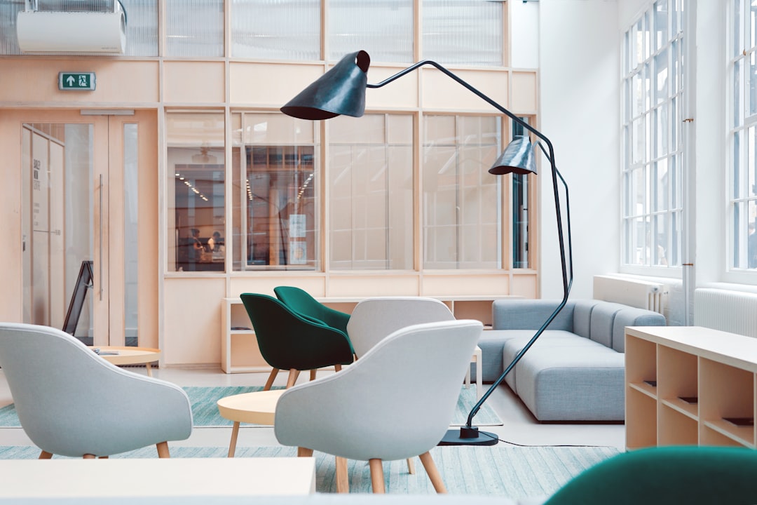
Popular Color Schemes for Living Rooms

In the realm of interior design, particularly within living rooms, color schemes play a pivotal role in establishing mood and aesthetic appeal. Current trends highlight specific palettes that not only enhance visual interest but also promote comfort and relaxation. Understanding these color schemes can significantly influence how a space is perceived and experienced by its inhabitants.
A well-selected color palette can blend various shades to create a harmonious environment. This is particularly important in a living room, which often serves as the heart of a home. Below are some of the trending color palettes that are making waves in contemporary living room designs.
Trending Color Palettes
The following color palettes are currently favored in living room designs, celebrated for their ability to create inviting and tranquil spaces. Each palette combines complementary shades that enhance the overall ambiance.
- Soft Neutrals: Shades of beige, taupe, and soft gray create a serene and timeless atmosphere. These colors can be paired with white accents to brighten the space and make it feel larger.
- Earthy Tones: Colors such as terracotta, olive green, and warm browns evoke a sense of connection to nature. These hues are often used to create a calming and grounding effect in the living room.
- Cool Blues: Light blues and muted teals provide a refreshing and tranquil vibe. These colors are known to promote relaxation, making them ideal for spaces meant for unwinding.
- Soft Pastels: Shades like blush pink, lavender, and mint green can add a touch of softness and warmth to a living room. These colors are often used in combination to create a harmonious blend.
- Bold Contrasts: Pairing deep navy with vibrant orange or rich burgundy with soft peach creates a dynamic and energetic space. These contrasting colors can stimulate conversation and creativity.
The selection of colors should take into account the desired atmosphere within the living room. The following color schemes are known for their ability to foster relaxation and comfort, making them excellent choices for living room settings.
Color Schemes Promoting Relaxation
Certain colors have been shown to promote a sense of calm and tranquility, which is essential in a relaxing living environment. Below are some schemes that encapsulate this effect.
- Cool Grays and Blues: This combination mimics the tranquility of the sky and sea, making it perfect for a soothing atmosphere.
- Pale Greens and Soft Whites: These shades evoke a refreshing feeling reminiscent of nature, which can help reduce stress.
- Warm Creams with Earthy Accents: A warm cream base with splashes of earthy tones can create a cozy and inviting space.
- Muted Lavenders and Grays: This soft combination offers a serene palette that encourages relaxation and comfort.
In crafting a cohesive living space, blending different shades is crucial for creating harmony. Various techniques can be employed to achieve a balanced look.
Blending Shades for Harmony
Achieving harmony in color blending involves a thoughtful approach to color placement and selection. Here are some strategies to consider:
- Monochromatic Schemes: Utilizing different shades of a single color can create a sophisticated and cohesive look. For example, various shades of blue can be layered through textiles, wall colors, and decorative accessories.
- Complementary Colors: Pairing colors directly opposite each other on the color wheel can create a vibrant yet balanced space. For instance, pairing soft blue with warm orange can bring energy without overwhelming the senses.
- Accent Walls: Introducing a bold color on one wall can serve as a focal point while allowing softer tones to dominate the rest of the space, creating contrast and interest.
- Textured Fabrics: Incorporating different textures in similar color tones can add depth and complexity to the color scheme, enhancing the overall aesthetic while maintaining harmony.
By thoughtfully selecting and blending colors, homeowners can create living rooms that not only reflect their personal style but also foster an environment of comfort and relaxation.
Choosing a Color Scheme for Small Spaces

In the realm of interior design, selecting an appropriate color scheme for small spaces can significantly influence the perception of size and ambiance. Careful consideration of color can create an illusion of openness, enhancing the functionality and aesthetic appeal of confined areas. This section will explore effective techniques and strategies for utilizing color to maximize the potential of small interiors.Utilizing color effectively in small rooms can create an impression of spaciousness.
Lighter colors are often recommended for compact areas as they reflect light, making the space feel airy and open. Conversely, darker shades can create warmth and intimacy but may also risk making a room feel constricted if not applied judiciously. The following points illustrate effective techniques for achieving a harmonious and expansive look in small spaces.
Techniques for Using Color to Enhance Space
The right application of color can enhance the perception of space in small interiors. Below are key techniques that can be employed:
- Light Colors: Using soft, light colors such as pastel shades or whites can dramatically open up a space by reflecting more light. This brightness can create an illusion of a larger area.
- Monochromatic Schemes: Sticking to a single color in varying shades can help create continuity, which visually extends the room.
- Glossy Finishes: Utilizing paint with a glossy finish can amplify light reflections, further enhancing the sense of space.
- Vertical Lines: Incorporating vertical stripes can draw the eye upward, giving the illusion of height, which is particularly effective in small rooms.
In small areas, the choice between lighter and darker colors requires careful thought. While lighter tones are generally preferred, the strategic use of darker colors can add character without overwhelming a small space. Below are considerations for selecting colors in confined areas.
Choosing Lighter Versus Darker Colors
The contrast between light and dark colors can be utilized to define spaces within a small room. Here are essential points to consider when making this choice:
- Lighter Colors: Ideal for ceilings and walls to maximize openness; they are particularly suitable for north-facing rooms that may lack natural light.
- Darker Colors: Best utilized as accents rather than predominant shades; they can add depth and interest but should be balanced with lighter elements to prevent a cramped feel.
- Transitional Shades: Utilizing mid-tones can provide a smooth transition between light and dark areas, creating visual interest without compromising space.
Accent walls serve as a powerful design element, even in small spaces. Implementing an accent wall can effectively enhance the room’s aesthetic without overwhelming it.
Effective Use of Accent Walls in Small Interiors
Accent walls can create focal points and add depth to small interiors. The following points highlight best practices for utilizing accent walls:
- Bold Color Choices: Choosing a vibrant color for an accent wall can draw attention and create a dramatic effect without encroaching upon the overall space.
- Textured Finishes: Using textured paint or wallpaper can add dimension to an accent wall, enhancing visual interest and depth.
- Strategic Placement: Positioning an accent wall opposite a window can create a striking visual balance, enhancing the natural light in the room.
- Artwork and Decor: Incorporating artwork or shelving on an accent wall can make it a feature point that adds functionality and style.
“Color is a power which directly influences the soul.”
Wassily Kandinsky
Seasonal Color Scheme Ideas

The choice of colors in home interiors can greatly enhance the ambiance and emotional feel of a space. Seasonal color schemes allow homeowners to refresh their environment by aligning it with the changing moods and tones of nature throughout the year. This exploration will detail distinct color palettes inspired by each of the four seasons, offering practical tips for adaptation, psychological insights, and sustainable options.
Color Palettes for Each Season
Each season evokes different emotions and aesthetic vibes, which can be beautifully reflected in home interiors. Below are five distinct color palettes for spring, summer, autumn, and winter, including complementary accent colors to enhance their effectiveness.
Spring Color Palettes
Spring is characterized by renewal and growth, often represented by soft and pastel colors:
- Soft Pink (#FFC1CC)
- Pastel Green (#A8D5BA)
- Lavender (#E6E6FA)
- Peach (#FFDAB9)
- Sky Blue (#87CEEB)
Complementary accents such as cream and warm beige can be used effectively in living rooms and bedrooms to create a serene atmosphere.
Summer Color Palettes
Summer brings vibrant energy, often reflected in bold and lively shades:
- Vibrant Yellow (#FFD700)
- Ocean Blue (#00BFFF)
- Coral (#FF7F50)
- Fresh Mint (#98FF98)
- Bright Orange (#FFA500)
To enhance these palettes, deep navy and charcoal can be utilized in kitchen spaces, providing a striking contrast that emphasizes the summer vibrance.
Autumn Color Palettes
Autumn is synonymous with warmth and richness, often represented by earthy tones:
- Deep Orange (#FF4500)
- Rich Brown (#8B4513)
- Mustard Yellow (#FFDB58)
- Burnt Sienna (#E25822)
- Olive Green (#556B2F)
Accent colors like deep burgundy and gold can add sophistication, making them ideal for cozy living rooms and dining areas.
Winter Color Palettes
Winter evokes feelings of calmness and tranquility, reflected in cool colors:
- Cool Gray (#A9A9A9)
- Warm White (#F5F5F5)
- Midnight Blue (#191970)
- Forest Green (#228B22)
- Berry Red (#8B0000)
To enhance the winter palette, consider using soft cream and silver accents, which can beautifully complement a minimalist aesthetic in bedrooms.
Adapting Color Schemes Throughout the Year
As seasons change, so can your home’s color scheme. Transitioning colors doesn’t require major renovations; instead, simple updates in décor can create a fresh look. Here are practical tips for incorporating new colors:
Accessorize
Swap out cushions, throws, and curtains to reflect the seasonal palette. For example, introduce pastel colors in spring and switch to deeper tones in autumn.
Paint Small Areas
For a more permanent change, consider painting smaller areas like an accent wall or furniture pieces that can be easily updated.
Incorporate Natural Elements
Use seasonal flowers or plants to bring in the colors of nature without needing extensive changes.
Psychological Effects of Seasonal Color Schemes
The colors chosen for each season can influence mood and ambiance in significant ways. For instance, spring colors promote feelings of renewal and optimism, creating a refreshing environment. Summer colors can energize and uplift, while autumn hues tend to create warmth and comfort, ideal for gathering spaces. Winter colors are associated with tranquility and introspection, encouraging relaxation.
Incorporating Seasonal Colors into Accessories
Updating accessories is an effective way to embrace seasonal colors without committing to a complete overhaul. Consider the following suggestions:
- Use seasonal-themed rugs to introduce rich colors for fall or light fabrics for spring.
- Change artwork or wall décor to feature seasonal landscapes that reflect the current palette.
- Layer textiles, such as throws and pillows, in seasonal colors for a quick refresh.
Transitioning Color Schemes Smoothly
A mini-guide for transitioning color schemes can help maintain an inviting home environment:
Spring to Summer (May to June)
Introduce bright and vibrant colors while gradually layering in more saturated tones.
Summer to Autumn (September)
Start substituting summer accents for warmer hues and textures that evoke fall.
Autumn to Winter (November)
Focus on deep, rich colors, adding soft whites and grays for a wintery feel.
Winter to Spring (March)
Slowly replace the darker tones with pastels and light colors as spring approaches.
Sustainable and Eco-Friendly Color Choices
Homeowners can make conscious choices by selecting eco-friendly paints and materials. Brands such as Benjamin Moore and Sherwin-Williams offer non-toxic paint options in a variety of seasonal colors, ensuring that your aesthetic choices are also environmentally friendly.
Engage with Local Stores
Before making final decisions on color schemes, engaging with local paint or home décor stores can provide valuable insights. Gathering samples and viewing colors in person will help ensure that the chosen palette resonates well within your home environment.
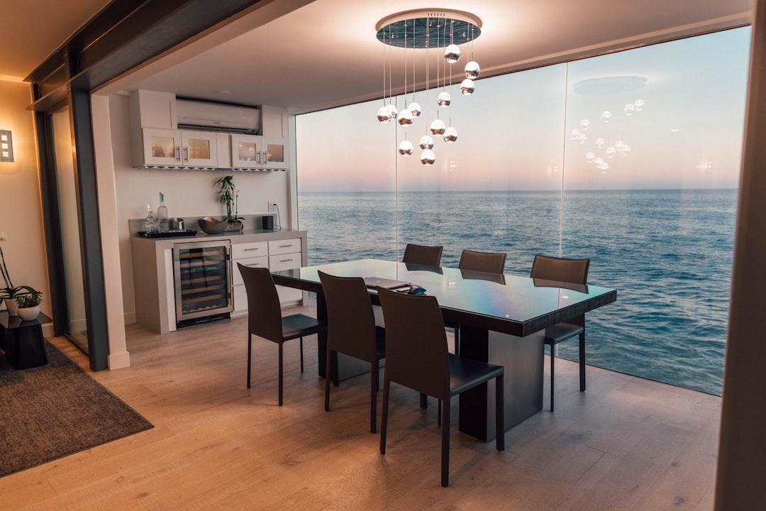
Color Schemes for Kitchens
The kitchen is often considered the heart of the home, where families gather and meals are prepared. Selecting an appropriate color scheme for this space is crucial, as it can influence not only the aesthetics but also the mood and functionality of the kitchen. A well-thought-out color palette can stimulate appetite, enhance creativity, and create a welcoming environment for both cooking and entertaining.When choosing colors for kitchens, it is essential to consider shades that promote appetite and creativity.
Warmer colors such as yellows, oranges, and reds are known to stimulate appetite and create an inviting atmosphere. Conversely, cooler colors like greens and blues can evoke calmness and cleanliness, making them suitable for a more relaxed cooking environment. To achieve a balance, integrating both warm and cool tones can lead to a dynamic and pleasing kitchen space.
Effective Color Combinations for Modern Kitchens
The selection of color combinations plays a vital role in modern kitchen design. Here are some effective color schemes that can enhance the aesthetic appeal of kitchen spaces:
- Cool Gray and Crisp White: This combination provides a clean, contemporary look. Gray cabinets paired with white countertops create a sleek, sophisticated atmosphere.
- Soft Sage Green and Cream: This palette introduces a touch of nature, fostering a fresh and airy feeling in the kitchen. Sage green walls with cream cabinetry create harmony and warmth.
- Deep Navy Blue and Gold Accents: Navy blue cabinets offer depth and elegance, while gold hardware introduces a touch of luxury. This scheme is particularly effective in modern kitchens aiming for a dramatic flair.
- Bold Red and Black: This vibrant combination is perfect for creating a striking focal point. Red accent walls paired with black cabinetry offer a chic and modern appearance.
The impact of cabinetry color on overall kitchen aesthetics cannot be understated. The choice of cabinet color influences not only the visual space but also the perceived size and functionality of the kitchen. Light-colored cabinets can make a small kitchen feel larger and more open, while darker cabinets add drama and richness. Additionally, contrasting colors can highlight architectural features and create depth, drawing attention to the design elements within the kitchen.
“The right color can transform the kitchen into a space that invites creativity and enhances the pleasure of cooking.”
Trends in Bedroom Color Schemes
Creating a serene bedroom environment that promotes relaxation and restful sleep is essential in today’s fast-paced lifestyle. Current color trends emphasize soft and soothing palettes that foster tranquility, while also offering opportunities to infuse energy and vibrancy through contrasting colors. By understanding the psychological effects of color, homeowners can make informed choices that enhance their bedroom experience.The use of color in bedroom design can significantly impact mood and atmosphere.
Soft hues such as pale blues, gentle greens, and muted lavenders are popular for their calming effects, promoting a restful ambiance conducive to sleep. In contrast, bolder colors can be used strategically to energize the space, creating a dynamic and inviting environment.
Palettes and Their Psychological Effects
To illustrate the effects of specific colors, the following table lists complementary color combinations that can create various moods in the bedroom:
| Color Combination | Examples | Suggested Paint Brands | Visual References |
|---|---|---|---|
| Soft Blue & Warm White | Sky Blue & Cream, Light Turquoise & Off-White, Baby Blue & Vanilla | Benjamin Moore, Sherwin-Williams | Imagery of tranquil blue bedrooms with bright accents and natural light. |
| Muted Green & Soft Gray | Pale Sage & Charcoal, Mint Green & Dove Gray, Olive Green & Ash Gray | Valspar, Behr | Visuals showcasing serene green bedrooms with gray details. |
| Warm Terracotta & Soft Neutral | Terracotta & White, Rust & Beige, Clay & Light Tan | Farrow & Ball, Dulux | Images depicting earthy, warm interiors enhancing coziness. |
Natural light plays a crucial role in how colors appear in a room. Bedrooms that face north receive cooler, dim lighting, which can make certain colors look colder or darker. On the other hand, south-facing bedrooms benefit from abundant natural light, making warm colors appear vibrant and inviting. To adapt color choices based on room orientation, consider using warm and bright colors in north-facing rooms to create a sense of warmth, while cooler tones can balance the brightness in south-facing spaces.
Seasonal Color Trends
Incorporating seasonal color trends into bedroom design can refresh and revitalize the space throughout the year. Soft pastels are favored in spring, while deeper jewel tones can create a cozy atmosphere in the winter months. The following suggestions can be adapted seasonally to maintain an inviting environment:
Spring
Light lavender, blush pink, and pale yellow.
Summer
Aquatic blues, bright greens, and sunny yellows.
Autumn
Warm rust, deep orange, and earthy browns.
Winter
Cool teal, rich burgundy, and soft gray.
Choosing Primary and Accent Colors
Selecting a primary color and secondary accents for a bedroom involves assessing existing furniture and decor. Follow this step-by-step guide for a cohesive color scheme:
1. Identify Existing Elements
Take stock of major furniture pieces and their colors.
2. Choose a Primary Color
Select a color that complements your existing decor, focusing on shades that create the desired mood.
3. Select Secondary Accents
Choose one or two accent colors that work well with the primary color to add depth and interest.
4. Test Swatches
Apply swatches of the chosen colors on the walls and larger furniture pieces to see how they look in different lighting throughout the day.
Importance of Texture and Finish
Texture and finish also significantly influence the perception of color in a bedroom. Matte finishes tend to soften colors, providing a cozy, intimate feel, while gloss finishes can enhance brightness and create a modern look. Incorporating a mix of textures, such as matte walls with glossy accents, can add visual interest and depth to the space.
Creating a Color Mood Board
To visualize your selected color scheme before implementation, creating a color mood board is beneficial. Begin by gathering paint swatches, fabric samples, and images representing your desired colors and textures. Arrange these elements together to assess how they interact visually. This method aids in ensuring a harmonious design while allowing for adjustments before finalizing your choices.
Harmonizing Colors with Home Decor
Creating a harmonious color scheme is essential for a cohesive and aesthetically pleasing home environment. By thoughtfully selecting colors that complement existing furniture and decor, you can enhance the overall ambiance of your space. This section will explore various methods to achieve color harmony, including principles of color theory, practical applications, and effective strategies for incorporating color throughout your home.
Applying Color Theory Principles
Color theory serves as a valuable foundation for selecting a harmonious color palette. Understanding various color relationships can guide your choices effectively. Here are some key principles:
- Complementary Colors: These are pairs of colors that are opposite each other on the color wheel, such as blue and orange. Using complementary colors can create vibrant contrasts that energize a space.
- Analogous Colors: This involves selecting colors that are next to each other on the color wheel, like green, blue, and teal. This scheme creates serene and comfortable environments, ideal for living rooms and bedrooms.
- Triadic Colors: This combination utilizes three colors evenly spaced around the color wheel, such as red, yellow, and blue. This method adds vibrancy and balance while allowing for creative expression.
Utilizing color swatches can help visualize how different combinations will appear under various lighting conditions, allowing for adjustments as needed. Additionally, the emotional impact of colors should be considered; for instance, using calming blues in bedrooms fosters relaxation, while energizing yellows can enhance productivity in kitchens.
Creating a Cohesive Color Palette
Developing a cohesive color palette is crucial for tying together various decor elements. A well-balanced palette includes a dominant color, a secondary color, and an accent color. This structured approach provides clarity and direction when selecting decor. To facilitate this process, consider the following:
- Color Wheel Application: Using a color wheel can help you identify harmonious pairings and accent colors that will complement your primary choices.
- Incorporating Textures and Patterns: Incorporate textures and patterns that reflect your chosen color scheme. For example, pairing a dominant navy blue with soft beige linens and a geometric patterned rug can create depth and interest.
Enhancing Decor with Color-Coordinated Accessories
Accessories play a significant role in reinforcing a room’s theme through color. Specific types of accessories can dramatically enhance the overall aesthetic, such as:
- Throw Pillows: These can introduce accent colors and patterns that align with the room’s palette.
- Rugs: A well-chosen rug can tie the color scheme together and provide a focal point.
- Art Pieces: Artwork with colors that resonate with your decor can add personality and vibrancy to your space.
DIY projects, such as painting vases or reupholstering chairs, can also contribute custom touches that reflect your color choices. Case studies of successful color harmonization often reveal striking before-and-after transformations, showcasing the profound impact of thoughtful color application.
Step-by-Step Guide for a Color-Coordinated Room Makeover
Embarking on a color-coordinated room makeover requires a structured approach. Follow these steps for a successful transformation:
- Initial Assessment: Carefully assess your current decor and identify areas that need improvement or enhancement.
- Mood Board Creation: Generate a mood board to visualize your desired outcome, incorporating colors, textures, and accessory ideas.
- Gradual Color Introduction: Introduce new colors incrementally to maintain balance and coherence, ensuring that each addition complements the existing decor.
Checklist for Selecting Harmonizing Paint Colors
Choosing the right paint colors is crucial for achieving a harmonious look. This checklist can guide your decisions effectively:
- Assess existing color undertones in fabric and wood to ensure compatibility.
- Test paint samples on walls at different times of the day to see how they interact with changing light.
- Consider the flow of color between adjoining rooms to create a cohesive look throughout the home.
Seasonal Decor Changes and Color Harmonization
Seasonal decor changes offer an excellent opportunity to refresh your home while maintaining color harmony. Consider the following tips:
- Develop seasonal color palettes that can be easily swapped out to reflect the time of year, such as warm earth tones for fall and bright pastels for spring.
- Organize color-themed events and parties that resonate with current trends, enhancing social gatherings.
- Store and maintain color-coordinated decorations properly to maximize their lifespan and ensure they remain vibrant throughout the years.
FAQ: Common Challenges in Color Harmonization
Addressing common challenges can help achieve a harmonious home environment. Here are some insights:
- When colors clash, reevaluate the color combinations using the color wheel to find balance or introduce neutral tones to soften contrasts.
- Selecting a neutral base that works with existing decor can create a versatile backdrop, allowing accent colors to shine.
- Blend vintage and modern decor through color by identifying common hues that connect both styles, creating a cohesive narrative in your space.
Color Scheme Ideas for Home Offices: Color Scheme Ideas For Home Interiors
Creating a home office that fosters focus and productivity is essential for anyone working from home. The choice of color can significantly impact mood and work performance. By selecting the right colors, you can create an environment that not only enhances your concentration but also maintains a professional aesthetic.Colors such as blue, green, and yellow are known for their productivity-boosting properties.
Blue is often associated with stability and calm, making it ideal for tasks that require concentration. Green brings a sense of balance and tranquility, promoting a refreshing atmosphere. Yellow, with its cheerful tone, can stimulate creativity and optimism. Combining these colors effectively can lead to an inviting workspace that encourages productivity while maintaining a professional appearance.
Effective Color Combinations for Home Offices
Selecting the right color combinations can transform a simple office space into a vibrant and motivating environment. Below are some effective color schemes that blend professionalism with warmth:
- Blue and White: This classic combination offers a clean and focused atmosphere, ideal for enhancing concentration while keeping the space bright and open.
- Green and Beige: The earthy tones of beige paired with refreshing green evoke a sense of nature, creating a calm and inviting environment for work.
- Grey and Yellow: The neutrality of grey provides a sophisticated backdrop, while yellow accents inject energy and creativity into the space.
- Soft Neutrals with Pops of Color: Using soft whites, creams, or taupe as a base with vibrant accents like teal or coral can create a modern and chic workspace that is both professional and welcoming.
“The right colors can not only beautify your workspace but also boost your creativity and productivity.”
Incorporating these color schemes into your home office will not only help in creating a visually appealing space but also foster an environment conducive to focus and efficiency. Emphasizing a harmonious balance between professionalism and comfort can lead to improved performance and satisfaction in your daily tasks.
Integrating Nature-Inspired Color Schemes
The integration of nature-inspired color schemes into home interiors brings a sense of serenity and calmness, evoking the tranquil beauty of the natural world. By drawing upon the colors found in forests, oceans, deserts, mountains, and flowers, homeowners can create spaces that not only look beautiful but also promote well-being and relaxation. This approach emphasizes the harmony between indoor environments and the outdoor world, allowing for an inviting and restorative atmosphere.
Distinct Nature-Inspired Color Palettes
Exploring various color palettes inspired by natural elements can provide fresh inspiration for home design. Below are five distinct color schemes that reflect different aspects of nature:
- Forest Palette: Deep greens, rich browns, and soft moss tones mimic the lushness of a forest. These colors promote a grounded and nurturing environment, ideal for living rooms and study areas.
- Ocean Palette: Shades of blue, turquoise, and sandy beige evoke the calm of the ocean. These cool tones are perfect for bathrooms and bedrooms, enhancing relaxation and a peaceful ambiance.
- Desert Palette: Warm earth tones like terracotta, soft yellows, and muted browns reflect the hues of a desert landscape. These shades work well in kitchens and dining areas, creating an inviting space for gatherings.
- Mountain Palette: Cool greys, slate blues, and soft whites simulate the serene beauty of mountain peaks. This palette is ideal for bedrooms and meditative spaces, encouraging tranquility and contemplation.
- Floral Palette: Soft pastels and vibrant floral colors such as lavender, rose, and sunny yellow bring the vibrancy of flowers indoors. These colors are excellent for children’s rooms and creative spaces, inspiring joy and creativity.
Using Earth Tones Effectively
Incorporating earth tones in home design allows for a seamless connection to nature. These colors can enhance the mood and functionality of different rooms:
- Living Room: Utilize warm browns and soft greens to create a cozy atmosphere. Add natural textures like wood and stone to enhance the earthy feel.
- Bedroom: Soft taupe and muted blues promote restful sleep. Layering these colors with plush textiles can create a nurturing environment.
- Kitchen: Incorporating sunny yellows with rich browns can enhance appetite and encourage social interaction, making it an ideal palette for culinary spaces.
Color Schemes that Evoke Tranquility
Several color schemes specifically designed to evoke a sense of tranquility and connection to nature can enhance home design:
- Soft Green and Beige: This combination reflects the calmness of a meadow, promoting relaxation and peace. Ideal for bedrooms and reading nooks, this scheme encourages a restful atmosphere.
- Cool Blue and White: Inspired by ocean waves, this color scheme enhances clarity and freshness, perfect for bathrooms and kitchens where cleanliness is a priority.
- Warm Taupe and Soft Sage: This combination evokes feelings of comfort and stability. Ideal for living rooms and dining areas, it fosters warmth and inviting spaces for gatherings.
Color Combinations to Avoid
To maintain a serene atmosphere, certain color combinations should be avoided as they may clash with nature-inspired themes. For example, pairing bright neon colors with earth tones can create visual discord. Additionally, overly saturated and contrasting colors, such as vibrant reds with muted greens, may disrupt the calming effect. Such clashing can lead to a dissonant environment that detracts from the intended tranquility.
Textural Elements to Enhance Color Schemes
Incorporating various textural elements alongside chosen color schemes can amplify the calming effect of the environment. Consider using:
- Natural Wood: Furniture or flooring made from reclaimed wood adds warmth and a tactile connection to nature.
- Stone Accents: Elements like stone countertops or decorative stones can ground a space and bring in natural patterns.
- Textiles: Soft, organic fabrics like cotton, linen, or wool in neutral tones can enhance comfort and visual appeal, complementing the chosen color palette.
Layering Colors for Depth and Interest
Layering colors thoughtfully can create depth and interest while maintaining harmony. Start with a base color on walls, then introduce complementary shades in furniture and accessories. For instance, a soft green wall can be enhanced with deeper green cushions and light wooden furniture, creating a cohesive and inviting space. Incorporate various shades of the same color family to ensure a soothing effect while avoiding overwhelming contrasts.
The Role of Natural Light
Maximizing natural light is crucial to enhancing the chosen colors effectively. Light can dramatically alter the perception of color throughout the day. In areas like living rooms and kitchens, opting for lighter shades can make spaces feel airy and open, while strategically placed mirrors can reflect light, amplifying brightness. In contrast, darker tones may be better suited for cozier, more intimate spaces like bedrooms, where softer light can create a restful atmosphere.
FAQ on Nature-Inspired Colors
When considering nature-inspired colors, several common misconceptions arise. For instance, it is often believed that vibrant colors cannot be balanced with neutrals. In reality, incorporating neutrals such as whites, greys, or beiges alongside vibrant greens or blues can create a visually appealing balance, ensuring that the space remains serene without appearing dull. Additionally, many wonder how to prevent dark colors from overwhelming a room; using light-colored trim or accents can create contrast and prevent a space from feeling closed in.
Cultural Influences on Color Schemes
The incorporation of color in home interiors is not merely an aesthetic choice but a reflection of cultural heritage and symbolism. Colors can evoke emotions, communicate values, and symbolize various aspects of life, influenced by the traditions and histories of different societies. Understanding the cultural significance of colors is crucial for creating spaces that resonate deeply with their inhabitants and visitors.Colors are imbued with various meanings across cultures, resulting in diverse color schemes that tell unique stories.
For instance, while white may symbolize purity and peace in Western cultures, it is associated with mourning in some Eastern traditions. The historical context of these color associations has shaped the design choices made in homes across the world.
Comparative Analysis of Traditional Color Schemes
Examining traditional color schemes reveals the richness of cultural narratives and historical contexts that have influenced these choices. Each culture has distinctive preferences that inform their use of color in home interiors, and understanding these can provide inspiration for modern design.
- Chinese Culture: Red is a dominant color symbolizing luck and happiness. Traditional Chinese homes often feature red accents, particularly during celebrations. This has been integrated into contemporary designs through red feature walls or decor items, paired with neutral tones to maintain balance.
- Indian Culture: Bright colors such as orange and yellow are prevalent, symbolizing joy and festivity. Many modern homes incorporate these vibrant shades through textiles and artwork, combining them with earthy tones to create a harmonious environment.
- Scandinavian Culture: Characterized by soft, muted colors such as pale blues and grays, which reflect the natural landscapes. Modern interpretations utilize these colors in minimalist designs, incorporating natural wood textures to enhance warmth.
Cultural colors can be effectively integrated into modern design through careful pairing and textural combinations. For example, combining bright cultural colors with contemporary furnishings can create a striking yet cohesive look, allowing heritage to shine within a modern context.
Psychological Effects of Color Perception
Cultural backgrounds heavily influence the psychological responses individuals have to colors, which is essential for interior design. Understanding these effects can guide choices that foster desired atmospheres within spaces.
- Red: In Western cultures, red often evokes feelings of passion and urgency, while in China, it signifies joy and prosperity, encouraging designers to use it in spaces meant for gathering.
- Blue: Universally calming, yet in some cultures, it might represent sadness or loss, thus care should be taken in its application.
- Green: Associated with nature and tranquility, green can create a peaceful ambiance; its significance as a symbolic color of fertility in various cultures further emphasizes its importance in interior spaces.
Case Studies of Cultural Color Integration
Several contemporary homes have successfully integrated cultural color schemes, showcasing the thoughtful blending of tradition and modern design. One notable case is a home in San Francisco that utilizes traditional Moroccan colors—deep blues and vibrant oranges—paired with sleek, modern furnishings. The design process involved sourcing authentic Moroccan tiles to create a backsplash that serves as both a focal point and a conversation starter, harmonizing modern aesthetics with cultural heritage.Another example is a Japanese-inspired home in Tokyo, where muted earth tones are complemented by minimalist decor.
The use of shoji screens and natural materials reflects a deep respect for nature, a fundamental aspect of Japanese culture, resulting in a serene living environment.
Guidelines for Selecting Culturally Significant Color Schemes
To honor cultural heritage while maintaining a modern aesthetic, it is essential to approach color selection with intention and respect.
- Research cultural significance: Understand the meanings behind colors in various cultures to ensure appropriate usage.
- Incorporate textures: Use textiles, materials, and patterns that reflect cultural traditions, enhancing the overall design.
- Sourcing materials: Choose decor items and furnishings that are authentic to the culture being represented, supporting artisans and preserving craft.
Impact of Globalization on Traditional Color Schemes
Globalization has led to a fascinating blending of cultural influences in modern design. Designers often draw inspiration from multiple traditions, creating diverse color palettes that reflect a global perspective. This blending enriches the design landscape but can also dilute the distinctiveness of traditional color schemes.
Visual References of Cultural Color Schemes
Visual references such as mood boards can assist in conceptualizing how cultural colors manifest in real-life settings. For instance, a mood board featuring a blend of vibrant Indian textiles alongside Scandinavian minimalist furniture can illustrate the balance of color and form.
Table of Color Meanings Across Cultures
A comparative table can provide insight into the meanings of colors in different cultures, showcasing how these interpretations influence design choices.
| Color | Western Culture | Chinese Culture | Indian Culture |
|---|---|---|---|
| Red | Passion, Love | Luck, Joy | Festivity, Energy |
| White | Purity, Peace | Mourning, Death | Purity, Simplicity |
| Blue | Calm, Sadness | Immortality, Healing | Tranquility, Depth |
Resources for Further Exploration
To deepen understanding of color symbolism in various cultures, the following resources are recommended:
- Books: “Color: A Natural History of the Palette” by Victoria Finlay explores the history of colors and their cultural significance.
- Websites: “Color Matters” offers insights into color psychology and cultural meanings.
- Documentaries: “The Secret Lives of Color” provides a visual narrative of the captivating stories behind various colors.
DIY Color Scheming Techniques
Creating harmonious color schemes for your home interiors can be an engaging and fulfilling process. By utilizing a few fundamental techniques, you can develop a personalized palette that not only reflects your style but also enhances the atmosphere of your living spaces. This section Artikels essential DIY color scheming techniques that will empower you to design color combinations that are both beautiful and functional.
Step-by-Step Color Wheel Creation
Understanding color relationships is crucial when selecting your palette. To start, create a color wheel using the primary colors: red, blue, and yellow. This will help you visualize how colors interact and complement each other. From this foundational understanding, follow these steps:
- Select a base color from existing fabrics, paint, or significant items within your home. This color will serve as the core of your color scheme.
- Choose two complementary colors that will enhance the base color. Ensure these colors contrast well for a balanced aesthetic.
- Integrate a neutral color, such as white, gray, or beige, to ground your palette. A recommended distribution might be 60% base color, 30% complementary colors, and 10% neutral.
- Document your process with photos and notes. This will serve as a valuable reference for future projects.
Benefits of Testing Colors
Before committing to a color scheme, it’s essential to test how colors appear in different environments. Variations in lighting can significantly alter the perception of color on various surfaces such as walls and furniture. Engage in the following techniques to assess your chosen colors:
- Paint small swatches on your walls or furniture to observe how they change throughout the day.
- Use poster boards painted with your selected colors to visualize their effect in your intended space.
- Acknowledge the impact of color psychology on mood and perception, ensuring that the selected colors align with the atmosphere you wish to create.
Utilization of Online Tools
In the digital age, numerous online tools can assist in generating color palettes. Notable tools include Adobe Color and Coolors. Here’s a mini-guide on their effective use:
- Start by entering your base color into the tool to see suggested palette options.
- Explore existing palettes for inspiration, and consider adjusting the hues to suit your preferences.
- Share your designs on social media or home design forums, utilizing hashtags to garner feedback and visibility within the DIY community.
Practical Applications of Color Schemes
Successful color schemes can transform spaces significantly. Here are examples of effective palettes used in various rooms:
Bedroom
Soft blues and whites create a calming retreat, fostering relaxation and tranquility.
Kitchen
Bright yellows and whites can energize the cooking space, making it inviting and cheerful.
Living Room
Earthy tones combined with vibrant accents can provide a cozy yet dynamic gathering area.Consider incorporating seasonal trends into your existing color schemes. For instance, adding warm tones in autumn or cool hues in winter can refresh your space without requiring a complete overhaul.
Resource Links for Further Learning
To deepen your understanding of color theory and DIY techniques, consider exploring the following resources:
- Articles on advanced color theory for interior design.
- Videos showcasing DIY color projects and transformations.
- Webinars offering expert insights into color selection and application.
Call to Action
Embrace the opportunity to create your own color schemes. Share your experiences, challenges, and successes within online communities or social media groups dedicated to DIY projects. Engaging with others can provide valuable feedback and inspire creativity.
Note on Color Accessibility
When selecting colors, it’s vital to consider color blindness and accessibility. Ensure your designs are inclusive by providing alternatives that cater to various visual needs. Utilizing patterns and textures alongside color can enhance accessibility and create a more welcoming environment for all individuals.
Color Schemes for Kids’ Rooms
Creating a vibrant and inspiring environment for children is essential to their growth and development. The choice of color scheme in kids’ rooms plays a significant role in fostering creativity, comfort, and a sense of safety. By selecting playful and harmonious colors, parents can transform these spaces into imaginative havens that resonate with their children’s personalities and preferences.When choosing color schemes for kids’ rooms, it is important to consider colors that inspire creativity while also promoting a calming and secure atmosphere.
Bright, cheerful hues can stimulate imagination, while softer tones can provide a restful backdrop. Additionally, incorporating bold accent colors can enhance the overall design and create focal points within the room. Below are some key elements to consider when selecting color schemes for children’s spaces.
Playful and Comforting Colors
The following colors are known for their ability to evoke feelings of joy and safety, making them ideal choices for children’s rooms:
- Sunny Yellow: This bright color encourages creativity and happiness, perfect for a playful atmosphere.
- Soft Blue: Known for its calming effects, soft blue can help create a serene environment, ideal for naptime.
- Pale Green: A nature-inspired color that promotes a sense of calm and safety, making it suitable for children’s spaces.
- Coral: This warm shade combines the energy of orange and the calmness of pink, fostering creativity and warmth.
- Lavender: A soothing color that can create a relaxing atmosphere, making it easier for kids to unwind.
Incorporating these colors can help achieve a balanced and inviting space that nurtures both creativity and comfort.
Using Bold Accent Colors
Accent colors can significantly enhance a child’s room by adding depth and vibrancy. When used strategically, bold colors can help define areas for play, study, and rest. The following examples illustrate how to implement accent colors effectively:
- Bright Red: A bold choice for accent furniture or decor, red can energize the space while being balanced with softer wall colors.
- Electric Blue: This striking color can be used for bedding or accessories to create a lively focal point against neutral walls.
- Vivid Orange: Perfect for play areas, orange can stimulate excitement and creativity when used on a feature wall or decor items.
- Cheerful Pink: Incorporating pink through accessories can add a fun and playful touch, especially in girl’s rooms.
- Bright Green: Ideal for a nature-themed room, using bright green for plants or decor can invigorate the space.
By integrating these bold accent colors alongside softer base colors, parents can create a dynamic and engaging environment that reflects their child’s personality while ensuring a sense of safety and comfort.
Minimalist Color Schemes
Achieving a minimalist look in home interiors involves the intentional use of a limited color palette that emphasizes simplicity and functionality. Minimalist design seeks to create serene environments that exude calmness and clarity, making color selection a crucial aspect of this aesthetic. By utilizing a carefully curated selection of colors, one can enhance the space’s overall harmony and visual appeal.To effectively achieve a minimalist style, neutral colors play a pivotal role.
These shades not only create a backdrop that complements various design elements but also foster an atmosphere of tranquility. Popular neutral colors include whites, grays, and beiges, which can be skillfully combined to maintain a cohesive and understated look. When applying neutral colors, consider varying the textures and finishes to add depth without sacrificing simplicity.
Effective Use of Neutral Colors
Neutral colors serve as the foundation for minimalist color schemes, allowing for versatility and a clean aesthetic. Their understated nature means they can be paired easily with bolder accents if desired. Here are key points for utilizing neutral colors effectively:
- Layering Textures: Incorporate different materials such as wood, metal, and fabric to add visual intrigue. For example, a soft beige sofa paired with a textured wool throw and a sleek glass coffee table creates a balanced look.
- Accent Colors: Introduce subtle accent colors to enhance the space without overwhelming it. Soft pastels or muted tones like sage green or dusty blue can add warmth and personality while retaining a minimalist feel.
- Monochromatic Schemes: Consider a monochromatic palette where various shades of a single color are used throughout the space. This approach can make a room feel larger and more cohesive. A room decorated in shades of gray can range from light gray walls to dark gray furniture, creating a sophisticated and serene environment.
- Natural Light: Emphasize natural light by using light-colored surfaces that reflect it, making the space feel airy. Large windows with sheer white curtains can allow light to filter gently, enhancing the minimalist effect.
Examples of Minimalist Color Combinations
Different spaces can benefit from various minimalist color combinations that evoke different moods and functionalities. Here are some examples tailored for specific areas in the home:
- Living Room: A combination of soft white walls with light gray furniture and a pale wood coffee table creates a calming and inviting atmosphere.
- Bedroom: Consider a very light beige for the walls paired with crisp white bedding and a single accent pillow in a muted sage green to introduce a hint of nature.
- Kitchen: Use a palette of cool whites and soft grays for cabinetry, complemented by stainless steel appliances for a clean, streamlined appearance.
- Home Office: A combination of light gray walls with darker gray furniture and minimal decorative accents in black can foster focus and clarity, ideal for productivity.
In summary, minimalist color schemes are characterized by their simplicity and elegance, achieved through the strategic use of neutral colors and thoughtful combinations. By understanding how to effectively utilize these elements, one can create harmonious and inviting spaces that promote a sense of peace and clarity throughout the home.
Color Schemes for Open Concept Spaces
Open concept spaces are highly sought after for their ability to foster a sense of connectivity and flow between different areas within a home. However, creating a cohesive color scheme in these expansive areas can be challenging. A well-thought-out color palette can enhance the spacious feel while ensuring that each zone retains its own character without feeling disjointed. When designing color schemes for open floor plans, it is essential to think strategically about how the colors interact with one another across the various sections of the space.
A harmonious transition can be achieved by selecting colors that complement each other and consider lighting variations throughout the day. Additionally, the use of accent colors can help define different areas without overwhelming the overall design.
Transitioning Colors Between Different Areas
To seamlessly transition colors in open concept spaces, consider utilizing a unifying color theme that acts as a foundation across all areas. This approach maintains visual coherence while allowing for variations that add character. Below are strategies to facilitate effective color transitions:
Start with a Neutral Base
Selecting a neutral color for the majority of walls creates a calming backdrop. Soft whites, beiges, or light grays can serve as a versatile base that unifies different areas.
Incorporate a Connective Color
Choose a specific color that appears in multiple rooms to create a visual thread. For instance, if the living area features a warm taupe, using the same taupe in the adjacent dining area can establish continuity.
Utilize Accent Colors
Implementing accent colors can help define different spaces. For example, a deep blue in the living room can be complemented with teal accessories in the kitchen, allowing for distinct yet cohesive zones.
Consider Flooring and Furnishings
The choice of flooring can influence color perceptions. A consistent flooring material across areas can tie the design together. Additionally, coordinating furniture in similar tones or styles can enhance overall unity.
Mind the Lighting
Different light sources can alter how colors are perceived. Natural light may enhance cooler tones, while artificial lighting can warm them. Test paint samples in different lighting conditions to ensure compatibility.
“Achieving a harmonious flow of color in open concept spaces is about finding balance between unity and individuality.”
Implementing these strategies will ensure that each area resonates with its own identity while contributing to the overall harmony of the open space. For instance, a living room and kitchen painted in complementary shades of green and blue can evoke a refreshing atmosphere, while warmer shades of amber and gold can create a cozy, inviting vibe. The key lies in thoughtful selection and application of colors that work in tandem to define an open concept home.
Future Trends in Color Scheming
As we look towards the future of home interiors, color scheming is poised to undergo significant transformations influenced by emerging design movements, sustainability considerations, and technological advancements. Understanding these trends not only helps in making informed design choices but also enhances the overall ambiance and emotional impact of our living spaces. This discussion will explore the anticipated color trends, their psychological implications, and practical applications across various rooms, alongside sustainable choices for eco-conscious homeowners.
Emerging Color Trends
The colors that define our home interiors are evolving to reflect current societal values and aesthetic preferences. Future trends are expected to lean towards nature-inspired palettes, calming hues, and vibrant accents that stimulate creativity and connection. Below is a categorized list of predicted colors based on current design movements:
Primary Colors
- Soft Sage Green: Evokes tranquility and connection to nature.
- Warm Terracotta: Adds warmth and a sense of grounding.
- Dusty Blue: Promotes serenity and spaciousness.
Secondary Colors
- Muted Coral: Brings warmth and cheer without overwhelming.
- Rich Plum: Adds sophistication and depth.
- Light Mustard: Offers a cheerful and inviting touch.
Accent Colors
- Vibrant Teal: Injects energy and creativity into spaces.
- Dark Forest Green: Grounding and bold, perfect for statement pieces.
- Bright Citrus: A refreshing burst that enlivens any area.
Sustainable and Eco-Friendly Colors
In response to growing environmental concerns, future color schemes will increasingly incorporate sustainable and eco-friendly options. Colors derived from natural materials not only enhance aesthetic appeal but also minimize environmental impact. Examples include:
- Clay-Based Paints: Offer natural hues while being biodegradable.
- Natural Dyes: Derived from plants, providing a unique color palette.
- Low-VOC Paints: Help maintain indoor air quality while minimizing harm to the environment.
Utilizing materials like reclaimed wood and organic textiles can further enhance these color choices, creating a cohesive and environmentally responsible design.
Impact of Technology on Color Trends
Technological advancements, particularly the rise of artificial intelligence (AI) in color forecasting, are reshaping the landscape of interior design. AI tools analyze vast amounts of data to predict trends, helping designers stay ahead of the curve. Additionally, social media platforms play a crucial role in popularizing specific shades, as users share their unique color applications and inspirations. This interplay between technology and design fosters an innovative environment where trends can evolve rapidly.
Practical Applications of Color Trends
Implementing these color trends effectively in home interiors requires thoughtful combinations tailored to each room’s function and desired mood. Here are some suggested applications:
- Living Room: Soft sage green paired with warm terracotta accents creates a welcoming and relaxed atmosphere.
- Kitchen: Dusty blue cabinets complemented by light mustard accessories foster a cheerful and inviting cooking space.
- Bedroom: Muted coral walls with rich plum bedding promote a cozy and restful environment.
Cultural Influences on Color Preferences
The colors we choose are often influenced by cultural backgrounds, reflecting traditional palettes and contemporary interpretations. For instance, Mediterranean regions often embrace earthy tones like terracotta and sea blues, while Scandinavian design favors muted pastels and whites for a clean, minimalist aesthetic. Understanding these influences can enhance the personal relevance and emotional resonance of color choices in home design.
DIY Tips for Adopting Color Trends
Homeowners interested in embracing future color trends affordably can consider the following DIY techniques:
- Experiment with paint types: Use matte or satin finishes to achieve different looks.
- Create custom colors: Mix paint to achieve desired shades, making adjustments to suit personal tastes.
- Incorporate accent walls: Use bolder colors on one wall to introduce trend colors without overwhelming the space.
These techniques empower individuals to personalize their spaces while keeping costs manageable.
Visual Reference Guide
Creating a visual reference guide can facilitate the selection of color schemes. Consider including swatches of the predicted colors alongside inspirational images that illustrate their application in various settings. For example, a swatch of vibrant teal may be paired with a photo of a contemporary living room featuring teal accents against a neutral backdrop.
Selecting Colors Based on Personal Style
When selecting colors for home interiors, it is important to consider personal style, lifestyle needs, and existing furnishings. Using a color wheel or palette generator tool can aid in making harmonious choices that resonate with individual preferences. This process encourages a thoughtful approach to color selection, ensuring a balanced and timeless design.
Closure
In summary, selecting the right color scheme for your home interiors is both an art and a science. By understanding the psychological effects of colors and how they interact within different spaces, you can create an environment that feels cohesive, comfortable, and inspiring. Whether you opt for bold contrasts or soothing neutrals, the possibilities are endless. Embrace the journey of transforming your home through thoughtful color choices, and enjoy the beautiful results that await.
FAQ Summary
What is the best color for a small room?
Lighter colors such as pale blues, soft greens, and light neutrals can make a small room feel more spacious and airy.
How do colors affect mood in home interiors?
Colors can evoke specific emotional responses; for example, blues are often calming, while yellows can create a cheerful and energetic atmosphere.
What colors should be avoided in a home office?
Bright, overly stimulating colors like bright red or neon shades may be distracting; instead, opt for calming hues that promote focus, such as soft blues or greens.
How can I incorporate seasonal colors without a full renovation?
Use accessories like cushions, curtains, and artwork to introduce seasonal colors, allowing for easy updates that reflect changing trends.
What are some common mistakes when choosing color schemes?
Avoid using too many colors or clashing combinations; instead, focus on a cohesive palette that includes complementary shades.