Did you know that the colors in your home can affect your mood and energy levels? Studies show that the right color palettes can make you more productive and calm. They can even change how you feel about food. With so many colors to choose from, picking the right interior design color schemes can be tough.
We’ll show you how to pick the best color combinations that match your style and your home’s look. Our expert advice will help you make your living spaces welcoming and peaceful.
Key Takeaways
- Understand how different colors impact your mood and energy
- Learn how to choose the right color palette for your home
- Discover expert tips for creating a harmonious atmosphere
- Explore the best color combinations for your living spaces
- Get guidance on selecting colors that reflect your personal style
Understanding the Psychology of Color in Interior Design
In interior design, color psychology is a powerful tool. It helps create spaces that feel welcoming, energizing, or calming. The colors we choose can greatly affect our mood, behavior, and well-being.
Colors can make us feel different emotions. For example, warm colors like red, orange, and yellow make us feel energetic and warm. On the other hand, cool colors like blue, green, and purple make us feel calm and serene.
How Colors Affect Mood
The impact of color on our mood is complex and well-studied. Different colors can change how we see things, feel emotions, and even react physically. For example:
- Red can make our heart rate go up and make us hungry.
- Blue is often linked with calmness and trust.
- Green is believed to balance our emotions, making us feel harmonious and relaxed.
Knowing these effects helps us choose the right colors for our homes.
Choosing the Right Colors for Different Spaces
Different rooms in our homes have different uses. The color scheme should match this. For instance:
| Room | Recommended Colors | Effect |
|---|---|---|
| Bedroom | Soft blues, pale greens | Promotes relaxation and sleep |
| Kitchen | Warm yellows, oranges | Stimulates appetite and conversation |
| Living Room | Neutrals with pops of color | Creates a welcoming and social atmosphere |
The right color can make a room more functional and inviting. It’s also key to think about the natural light and furniture when choosing colors.
By understanding color psychology and using it wisely, we can make our homes beautiful and supportive of our well-being and lifestyle.
Popular Interior Design Color Schemes for 2023
2023 is all about bright colors in home decor. We see earthy tones, monochromatic schemes, and bold contrasts everywhere. These modern color schemes aim to mix style with function beautifully.
Earth Tones: Bringing the Outdoors In
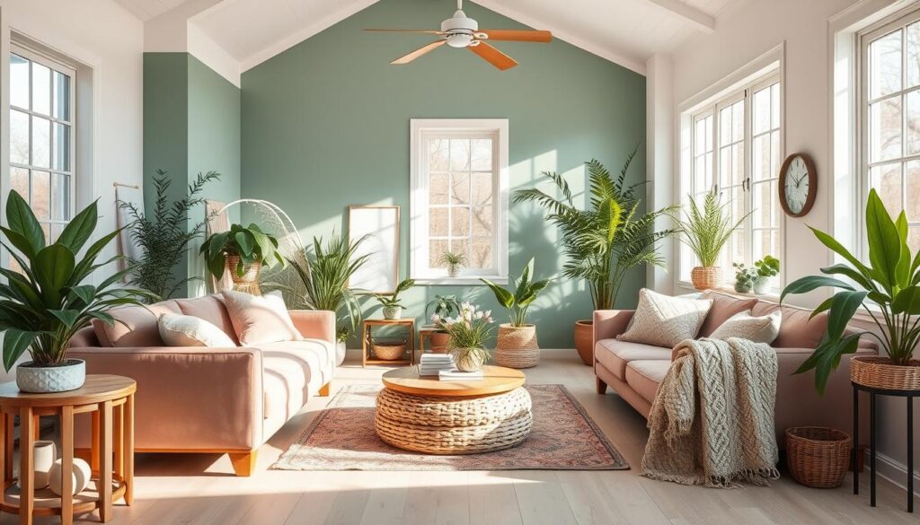
Earth tones are in because they bring nature indoors. Shades like green, terracotta, and beige calm and connect us to the outdoors. Adding earthy tones makes your home cozy and welcoming.
Monochromatic Palettes: The Power of Simplicity
Monochromatic schemes use different shades of one color for a sleek look. They make rooms feel bigger and cleaner. Use various shades and textures, like light walls and dark furniture, to enhance this look.
Bold Contrasts: Making a Statement
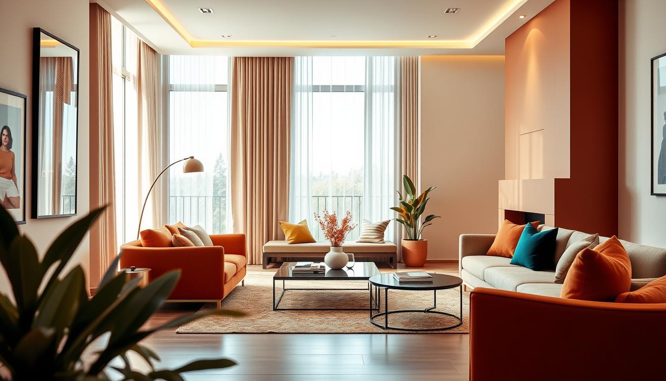
Contrasting colors make a big impact. Pairing colors from opposite sides of the color wheel adds energy. But, balance bold colors with neutral ones to avoid overwhelming the space.
Using Neutrals to Create a Calming Atmosphere
Neutral tones are key to a calming interior design. They offer a blank canvas for your style. This makes your home a place of peace and comfort.
Neutrals are timeless, which means they stay in style. They’re a smart investment for your home. Plus, they let you add color with furniture and decor easily, keeping your space fresh.
Shades of Gray: Versatile and Elegant
Gray is a versatile neutral that suits many spaces. Light grays make rooms feel open, while dark grays add warmth. Finding the right balance is key to using gray well.
Gray is also practical for busy homes. It hides dirt and stains better than lighter colors, making it great for families and pets.
Warm Vs. Cool Neutrals: Finding Balance
Neutrals come in warm and cool tones. Warm neutrals, like beige, feel cozy. Cool neutrals, like white, are crisp and clean. Finding the right balance is essential for a peaceful home.
Knowing about different neutrals helps you create a calm space. It shows your style and meets your needs.
The Importance of Accent Colors in a Scheme
Adding accent colors to your design can really make a space pop. They add depth and interest, making the room feel more alive. This creates a richer, more layered look.
Choosing the Right Accent Color
Finding the right accent color is key. It can either enhance or clash with your main colors. Think about the mood you want in your space. Soft colors like pale blues or mauves can calm a room. Bold colors like reds or oranges can energize it.
Here are some ways to pick an accent color:
- Choose a color already in your furniture or decor and make it stand out.
- Follow the 60-30-10 rule: 60% of the room is a main color, 30% a secondary, and 10% an accent.
- Look at the color wheel and pick colors that complement or are similar to your main colors.
How to Use Accents Effectively
After picking your accent color, it’s time to use it in your design. You can add it with furniture, rugs, throw pillows, and more. The goal is to add interest without overwhelming the space.
Here are some tips for using accents well:
- Begin with small items like throw pillows or vases to introduce your accent color.
- Use bold pieces like artwork or furniture to draw attention to certain areas.
- Think about the texture and finish of your accent items to add variety.
By carefully choosing and using accent colors, you can make your space more engaging and personal. It will show off your style and personality.
Color Schemes for Small Spaces
Decorating small spaces is more than just picking colors you like. It’s about choosing a palette that makes the space feel bigger. The right color scheme can greatly change how a room feels, making it seem more open or cramped.
Light Colors to Open Up Rooms
Using light colors on walls and ceilings is a great way to make small rooms look bigger. Light colors reflect light, making the space feel more open and airy. Shades of white, cream, or pale gray work well for this.
- Soft whites and creams can add a warm touch to your space.
- Pale grays and blues can create a calming and spacious atmosphere.
- Using a single light color for walls, ceilings, and trim can enhance the sense of continuity and space.
Strategic Color Blocking: Eclectic Designs
While light colors can make a room feel larger, strategic color blocking adds visual interest. This means using bold or contrasting colors in specific areas to create focal points.
- Identify a feature wall or area that you want to highlight.
- Choose a bold or contrasting color that complements the overall color scheme.
- Use the bold color sparingly to avoid overwhelming the space.
By balancing light colors with strategic color blocking, you can create a harmonious and visually appealing space. It will feel larger than it is.
Color Trends for Different Rooms
The latest color trends show how important it is to match colors with each room’s purpose. Each room in our homes has its own role. The colors we pick can greatly change how each space feels and works.
Living Rooms: Comfort and Style
Living rooms are the heart of the home, where we spend time with loved ones. We suggest warm, inviting colors for comfort and conversation. Some popular color combinations for interiors are:
- Earth tones such as terracotta and sienna
- Soft neutrals like beige and cream
- Rich jewel tones like emerald green and navy blue
Bedrooms: Peaceful Retreats
Bedrooms are our rest and recharge spots. Softer, calming colors are best here. Some soothing color options are:
- Soft blues and pale lavenders
- Mint green and other pastel shades
- Neutral tones like gray and taupe
Kitchens: Vibrant and Energetic
Kitchens are full of activity and energy. They’re perfect for bright, vibrant colors. Modern kitchen color schemes often include:
- Bold colors like red and orange
- Crisp whites and clean linens
- Deep, rich colors like navy blue and forest green
Choosing the right colors for each room makes our homes beautiful and functional.
How to Test Paint Colors Before Committing
Choosing the right paint color can be tough. But testing samples on your walls can help. It’s not just about picking a color you like. It’s about making sure it looks good in your space, no matter the light.
Sample Swatches: A Must-Do
Using sample swatches is key when picking paint. Apply them to different parts of your wall. This lets you see how the color looks at different times and under different lights.
“The most important thing is to test the paint on a large area, not just a small swatch.” This shows how crucial it is to see the color on a bigger surface.
Lighting Effects on Color Perception
Lighting can change how a paint color looks in your home. Natural light, artificial light, and the colors around you all play a part. For example, a color might look great in bright sunlight but not in dim light.
- Consider the orientation of your room: Rooms that face north receive cooler light, while those that face south receive warmer light.
- Test colors under different lighting conditions: Observe how the color looks during the day and at night with your artificial lighting on.
- Think about the color temperature of your light bulbs: Warm white light can make colors appear more yellow, while cool white light can make them appear bluer.
By considering these factors and using sample swatches, you can choose a paint color wisely. This ensures it will enhance your space as you want.
Seasonal Color Trends and Their Impact
New color trends come with each season. They give homeowners a chance to refresh their homes and keep them stylish. It’s key to know how the seasons affect our color choices.
Spring and Summer: Fresh and Light
In spring and summer, we see light and fresh colors. These seasons are great for using pastel shades, whites, and soft neutrals. They match the season’s brightness and energy.
Popular Spring and Summer Colors:
- Soft peach and coral tones
- Mint green and aqua blues
- Bright and airy whites
- Pale yellows and sunshine hues

Fall and Winter: Warm and Cozy
Fall and winter are for warm, cozy colors. These seasons are perfect for rich, deep tones. They make our homes feel warm and inviting.
Popular Fall and Winter Colors:
- Warm reds and burgundy shades
- Deep oranges and golden yellows
- Rich browns and taupes
- Soft grays and creamy whites
| Season | Color Palette | Atmosphere |
|---|---|---|
| Spring/Summer | Pastels, whites, soft neutrals | Fresh, light, airy |
| Fall/Winter | Rich tones, deep reds, warm neutrals | Warm, cozy, inviting |
By using seasonal colors, homeowners can keep their homes looking modern and fresh. This way, they match the latest trends and timeless choices.
Creating a Cohesive Color Flow Throughout Your Home
Making your home’s colors work together can really boost its look. A unified color scheme makes your home feel bigger and more welcoming.
To get this right, think about how colors move from one room to the next. Pick a color palette that works for all your spaces. It’s not about every room being the same color. It’s about finding a thread that ties them together.
Transitioning Between Rooms
Use a main color and its variations to move from one room to the next. For example, if your living room is blue, use lighter or darker blues in other rooms. This makes the transition smooth.
Another trick is to use a neutral color as a bridge. This helps keep the flow going and stops your home from feeling broken up.
The Role of Furniture and Decor
Furniture and decor are key to keeping your colors flowing. Choose items that match your color scheme to keep the look going.
For example, if you love earthy tones, pick furniture with natural wood or earthy colors. Decor like vases, rugs, and art can also match your colors. This makes your home feel more connected.
As interior design experts suggest, “The right furniture and decor can make your home’s colors work together.” Paying attention to these details can make your home feel warm and inviting.
Designing with Color for Families and Pets
In homes with families and pets, the right color scheme is key. It should look good and be practical. Finding the perfect colors can be tough, but it’s doable with the right strategy.
Choosing Durable and Practical Options
When picking colors, think about how they’ll last, even in busy spots. Neutral colors like beige, gray, or taupe are great. They hide dirt and stains well. Plus, they let you easily change up your decor with new furniture and accessories.
For homes with kids, color matters a lot. Soft pastels or gentle neutrals can make bedrooms and playrooms feel calm. But, in the kitchen or living room, brighter colors can add energy and warmth.
How Color Can Hide Wear and Tear
The right color can make your home look newer for longer. Dark colors can hide stains and dirt, but they might show dust and pet hair more. On the other hand, light colors make rooms look bigger and cleaner, but they need more cleaning.
Using different colors together can make your space look balanced. For example, light walls with dark furniture and accents can add interest. It also helps hide stains and wear.
By following these tips, you can make a home that’s both beautiful and tough. Whether you’re looking for popular color combinations for interiors or tips on incorporating accent colors into your design, finding the right balance is key.
Sustainable Color Choices in Interior Design
Today, we’re more aware of environmental issues. This makes choosing sustainable colors in interior design very important. The colors we pick for our homes help reduce our environmental impact.
Choosing eco-friendly paint is a big part of sustainable color choices. Traditional paints can have harmful chemicals called VOCs. These chemicals can pollute the air inside and outside our homes. Eco-friendly paints, made from natural ingredients, have low or zero VOCs. They are healthier for our families and the planet.
Eco-Friendly Paint Options
When picking eco-friendly paint, look for low-VOC or zero-VOC labels. These paints are better for the environment and improve indoor air quality. Also, consider paints made from natural ingredients like clay, lime, and plant dyes. These options are sustainable and offer unique, natural colors for your home.
The Impact of Color on Well-Being
Colors greatly affect our mood and well-being. Some colors can relax us, boost energy, or improve focus. For example, soft blues and greens create a calming atmosphere, great for bedrooms or meditation rooms. Vibrant yellows and oranges stimulate creativity and energy, perfect for living areas or home offices.
Knowing how colors affect us helps us choose wisely for our homes. By picking colors that support well-being, we create spaces that are not just beautiful but also good for our mental and emotional health.
Using sustainable colors in our interior design makes our homes healthier and more eco-friendly. By choosing eco-friendly paints and thinking about color’s impact on our well-being, we can design homes that are stylish and sustainable.
Final Thoughts on Choosing the Right Color Scheme
Choosing the right color scheme for your home can be tough. But, by thinking about what you like and what’s popular, you can make a beautiful and useful space. When picking colors, remember to choose ones that show your style and fit your life.
Balancing Personal Taste and Trends
It’s easy to get caught up in the latest trends. But, it’s key to mix them with what you like. Think about your favorite colors and how they’ll work together. This way, you’ll get a look that’s both trendy and timeless.
Confidence in Color Choices
To feel sure about your color choices, look at different palettes and pick the best ones for your home. Try out samples and think about your space’s lighting. By exploring your options, you can pick colors that make your home feel special and show off your unique style.


